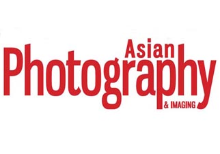
It is said that a brand name and its logo are supposed to project what the company, its people and their objective are. One of the first things that any organisation must decide on is its logo, or, as in our case, its masthead. But over the years every business undergoes transformations of some or the other sort. And the logo Asian Photography has a similar story.
It was 25 years ago when the journey of this magazine started, but Asian Photography was not always known by the same name. In fact when Mr. Trilok Desai, MD and Publisher, SAP MEDIA WORLDWIDE LTD started the company, the flagship title was Amateur Photography. The magazine in those days was much like the nascent stage of the industry then. The designs were very 80s and the content and images all seemed to lack a certain punch, compared to current standards. Amateur Photography and its logo were adopted for almost a decade before our current brand name Asian Photography came into existence.
The current name of the magazine was adopted in order to give it a new look, dimension and feel, and alter the content accordingly. The ideology behind using the word “Asian” was to encapsulate the beauty of Asia and cover a larger footprint beyond just India. It was also to standardise the look of the masthead as per international standards, since the magazine had started broadening its horizons on the international map.
The look of our masthead projected style, elegance and class. All of these would work together to deliver crisp and precise content to our readers of 25 years. But gradually, we grew from a small, promising child into a full grown successful human being. Around six years back we started the APAC edition of Asian Photography, instituted an awards set that is unquestionable and gave birth to the idea of Top 10 Most Influential People in Photography.
The journey of our magazine has been nothing less than that of a child actor. From a child artist to a full-fledged superstar today, the last few years have seen exponential growth of our magazine in many spheres. And in line with all that we have been through, we feel that our journey has just begun. In these 25 years we have come a long way, and all that time has also shaped us into who we are today. That is the reason why we felt that on the even of our 25th Anniversary it was time to project our presence as a much stronger and a more passionate brand that we have become today. And thus, the change in the logo, style and design of the magazine from the January 2013 issue of the magazine.
We hope that you like the new look, design and content of the magazine.
Bhavya Desai


