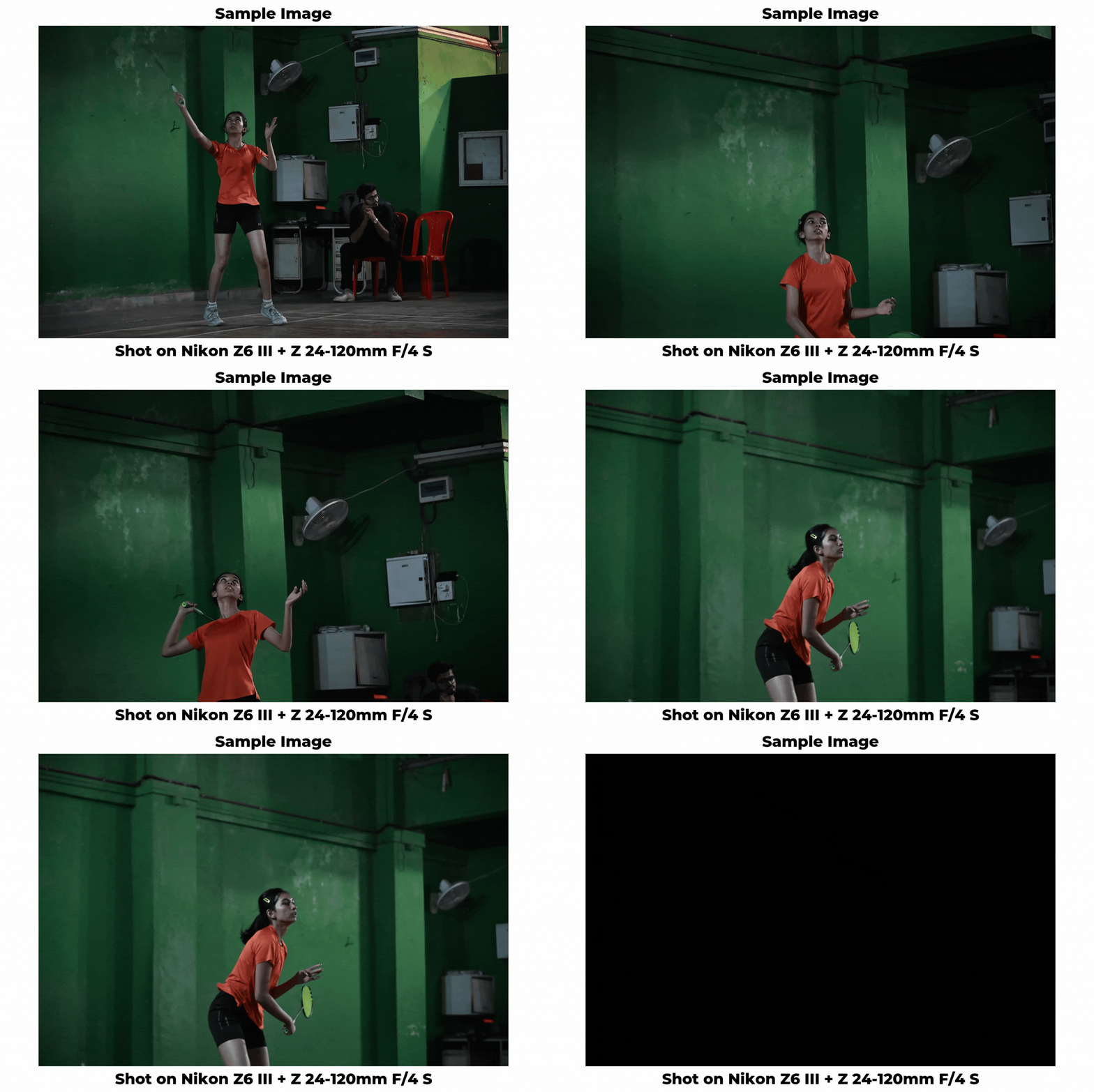
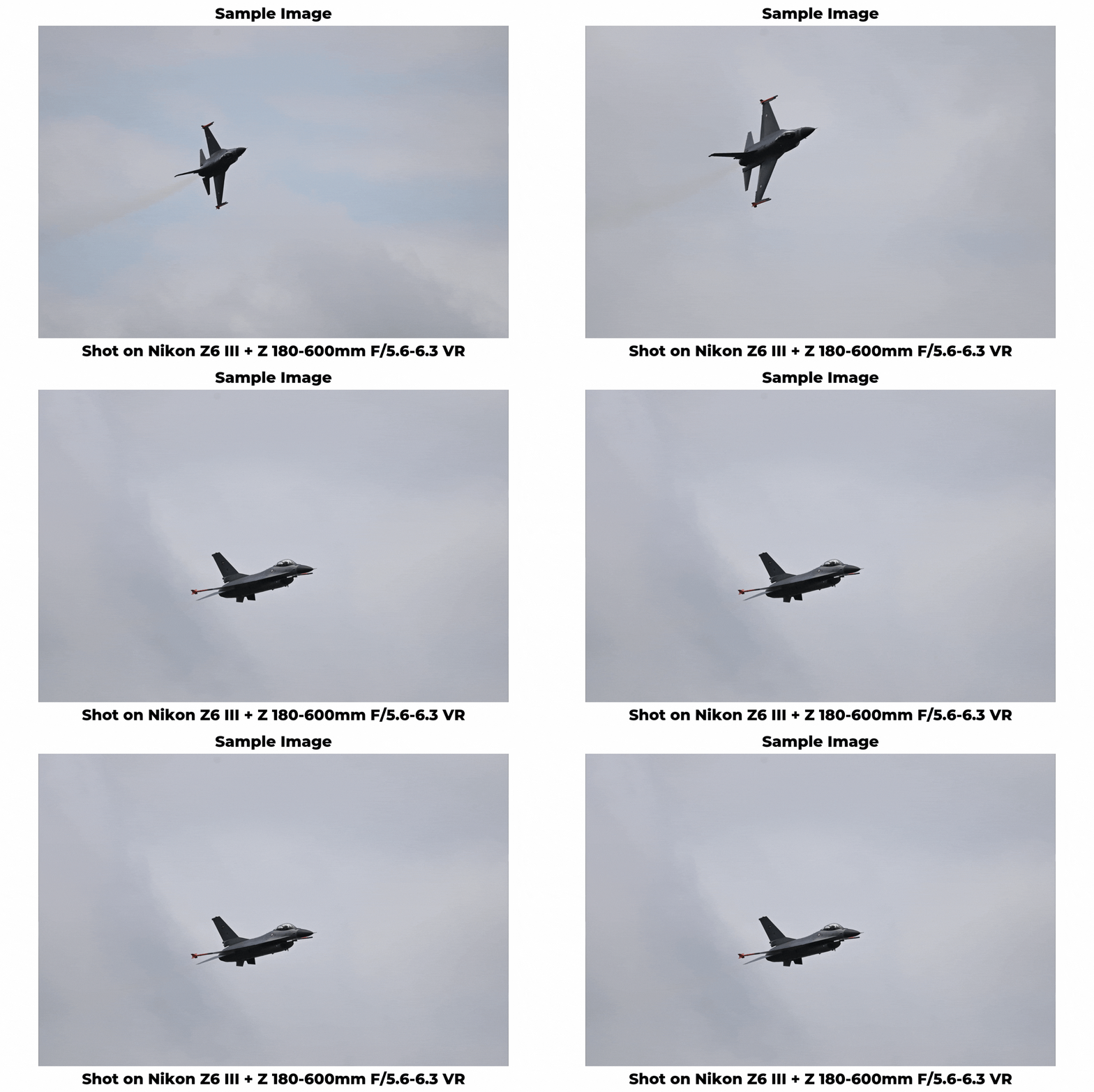
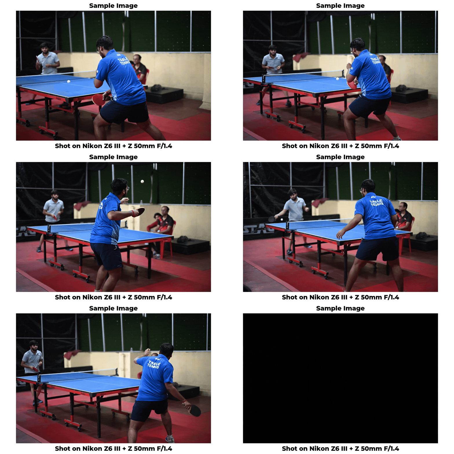
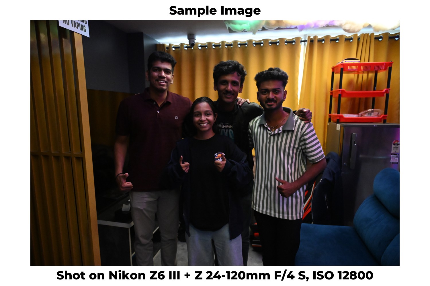
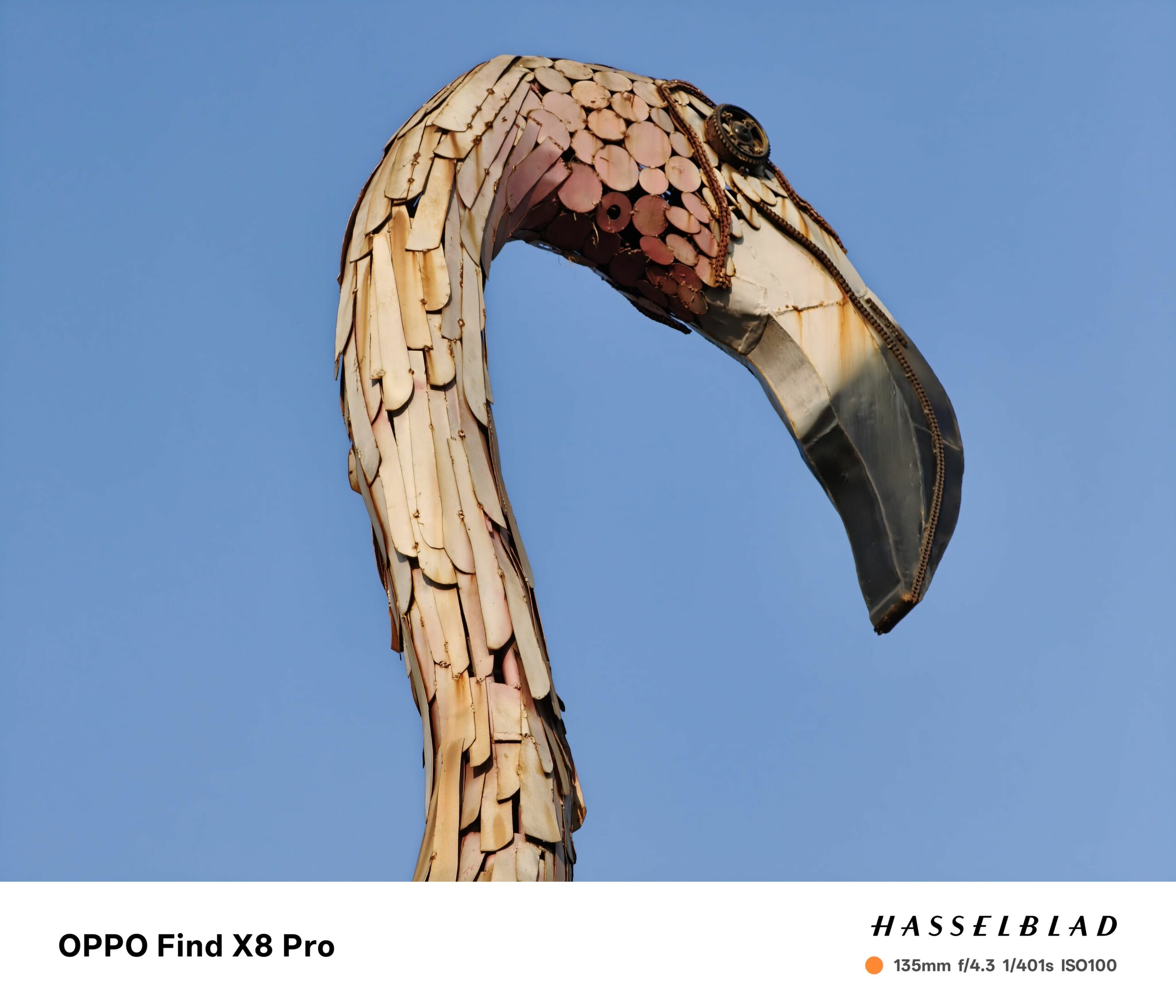
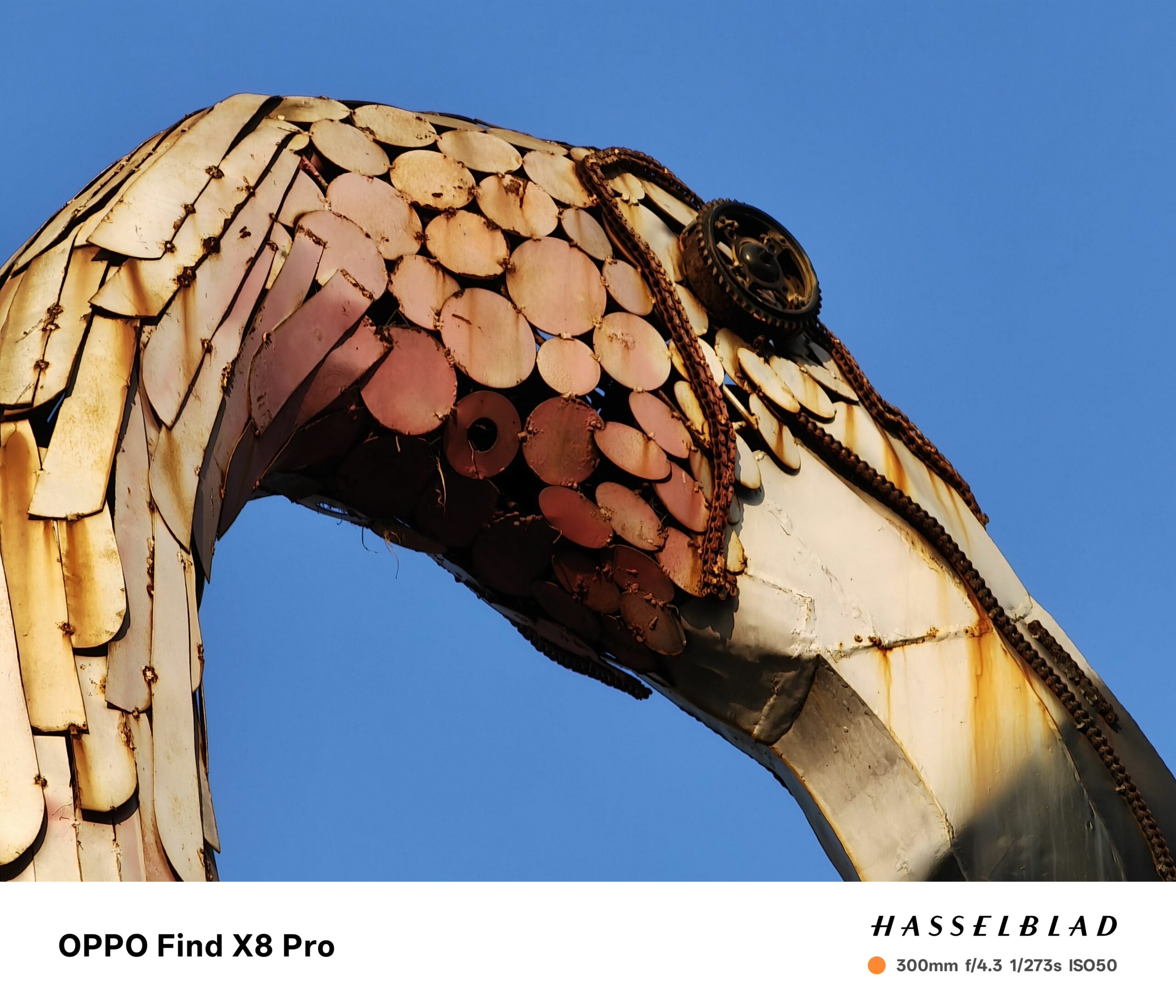
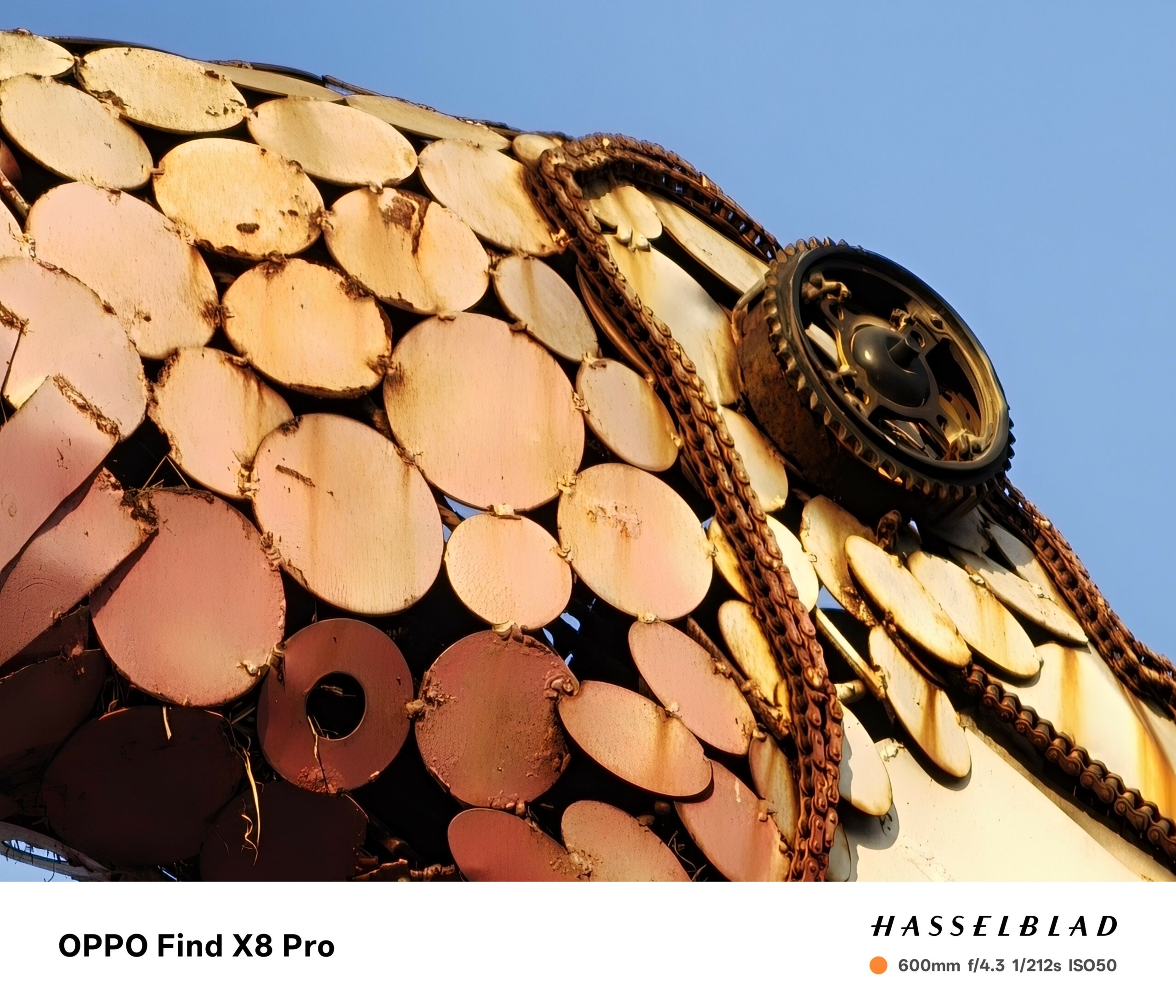
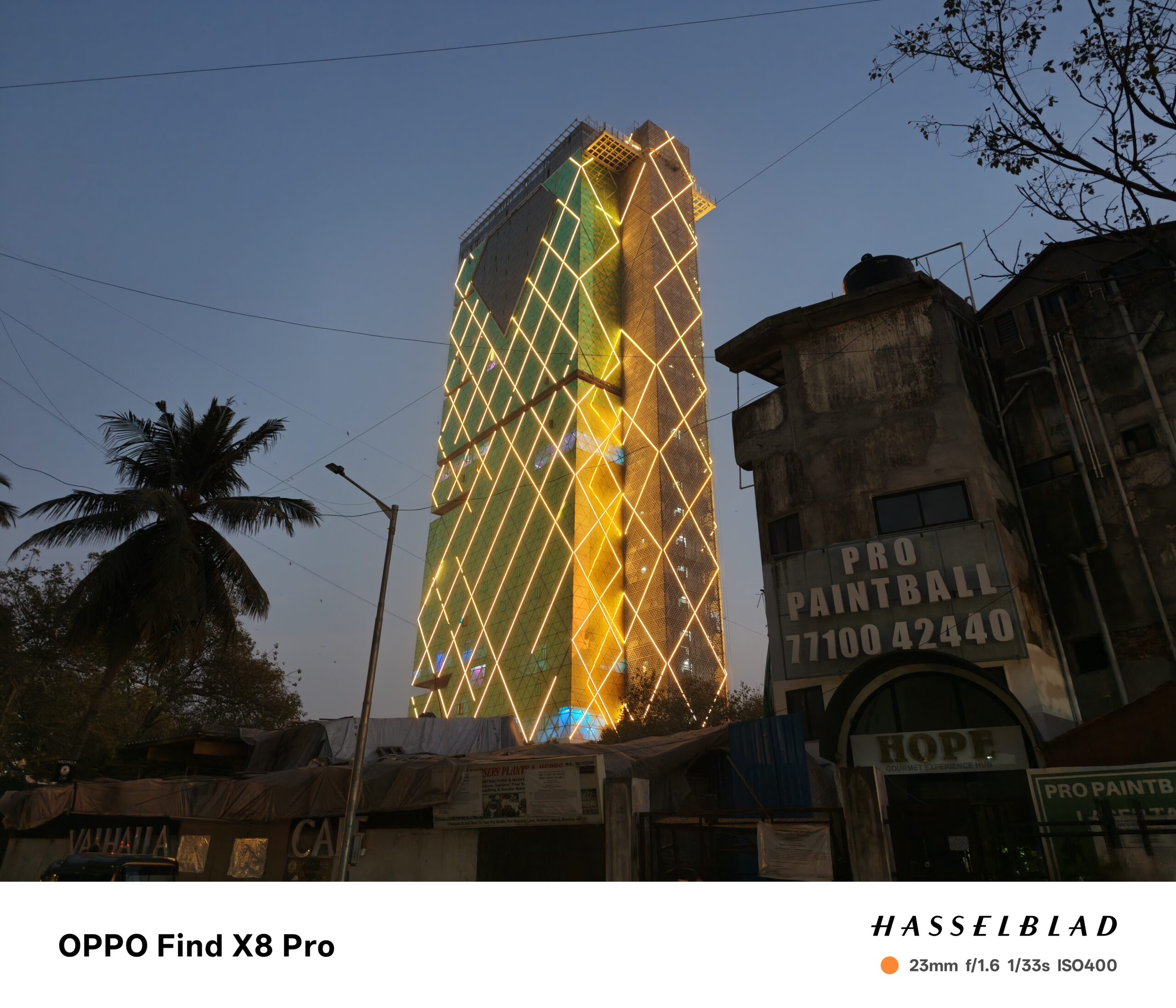
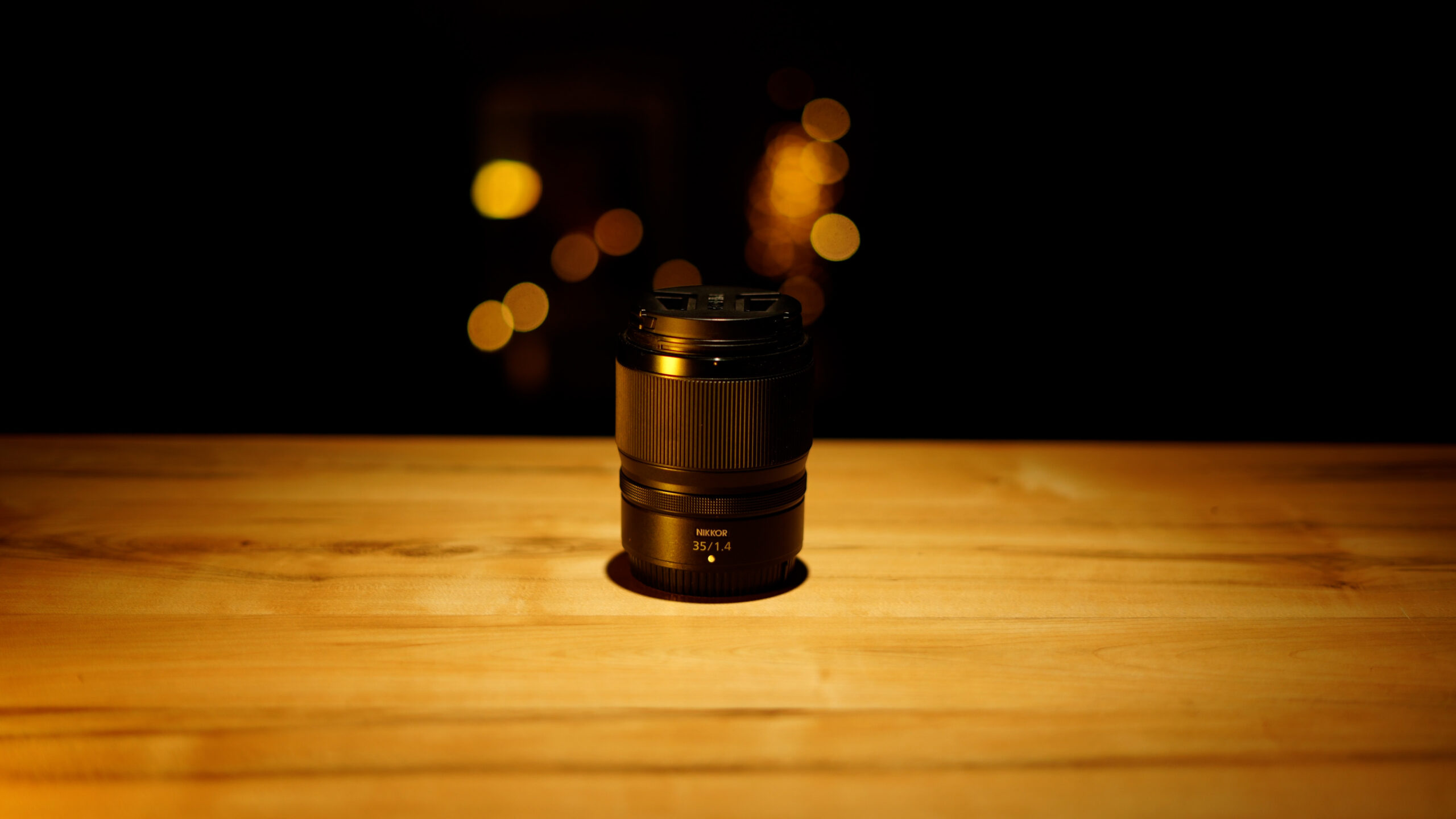
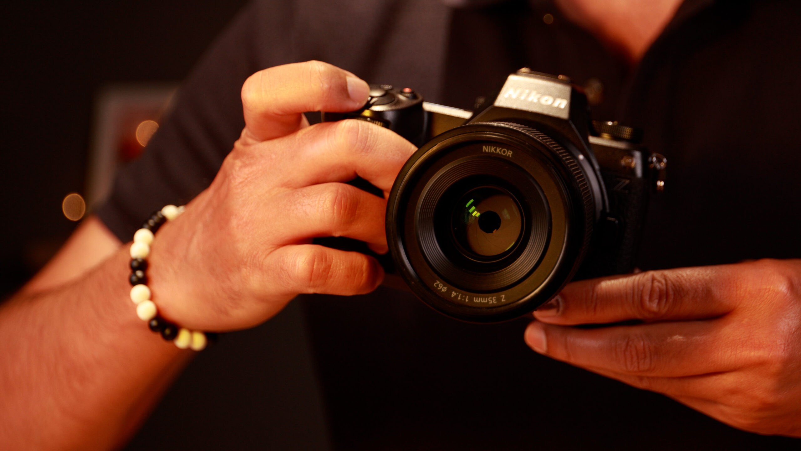
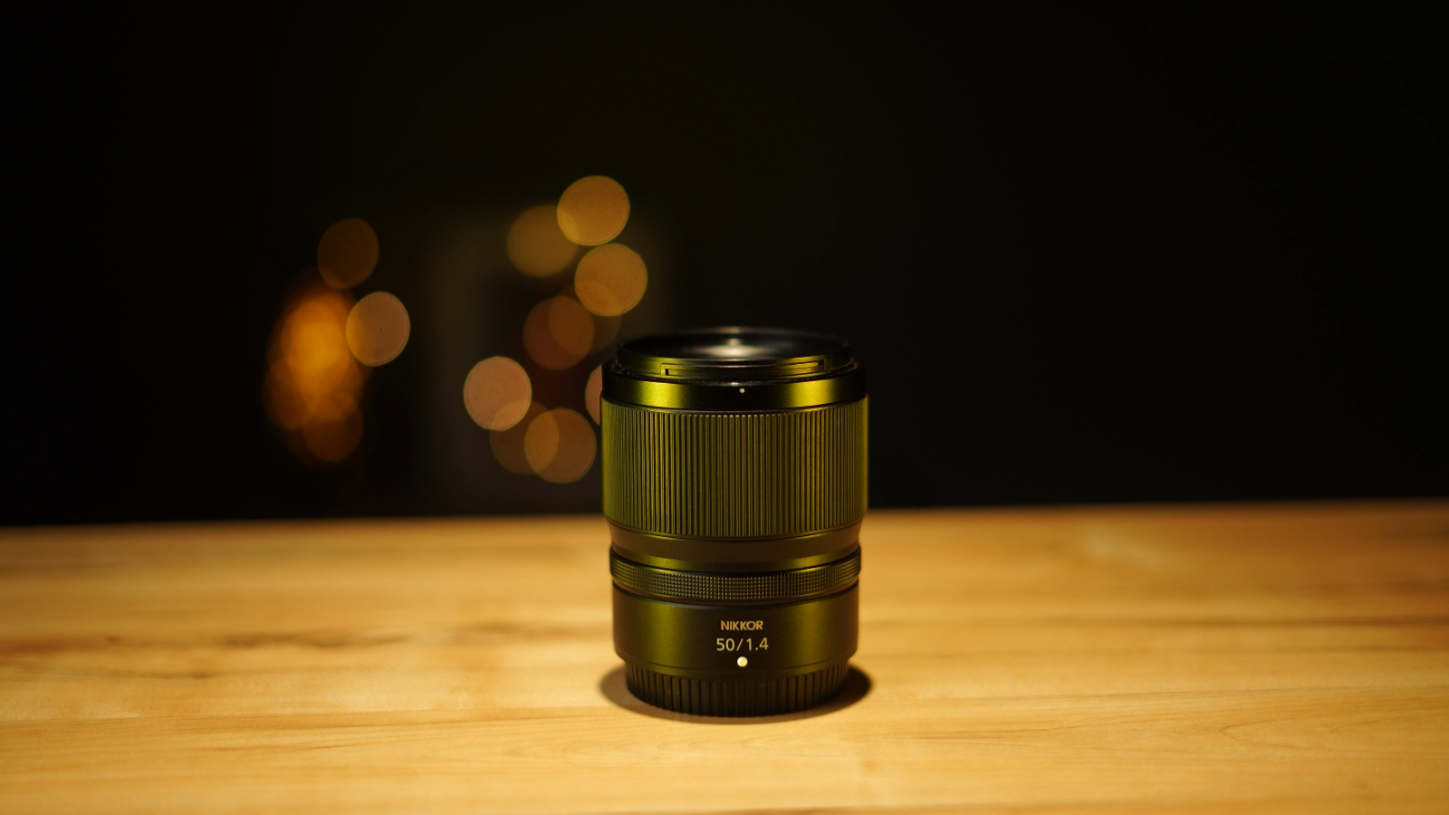
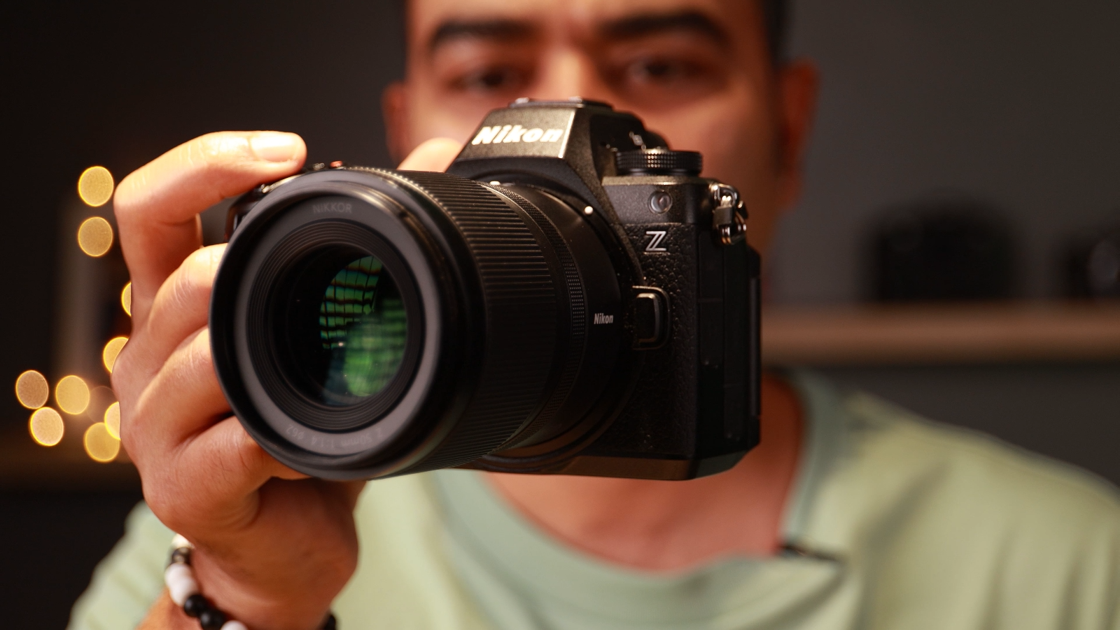
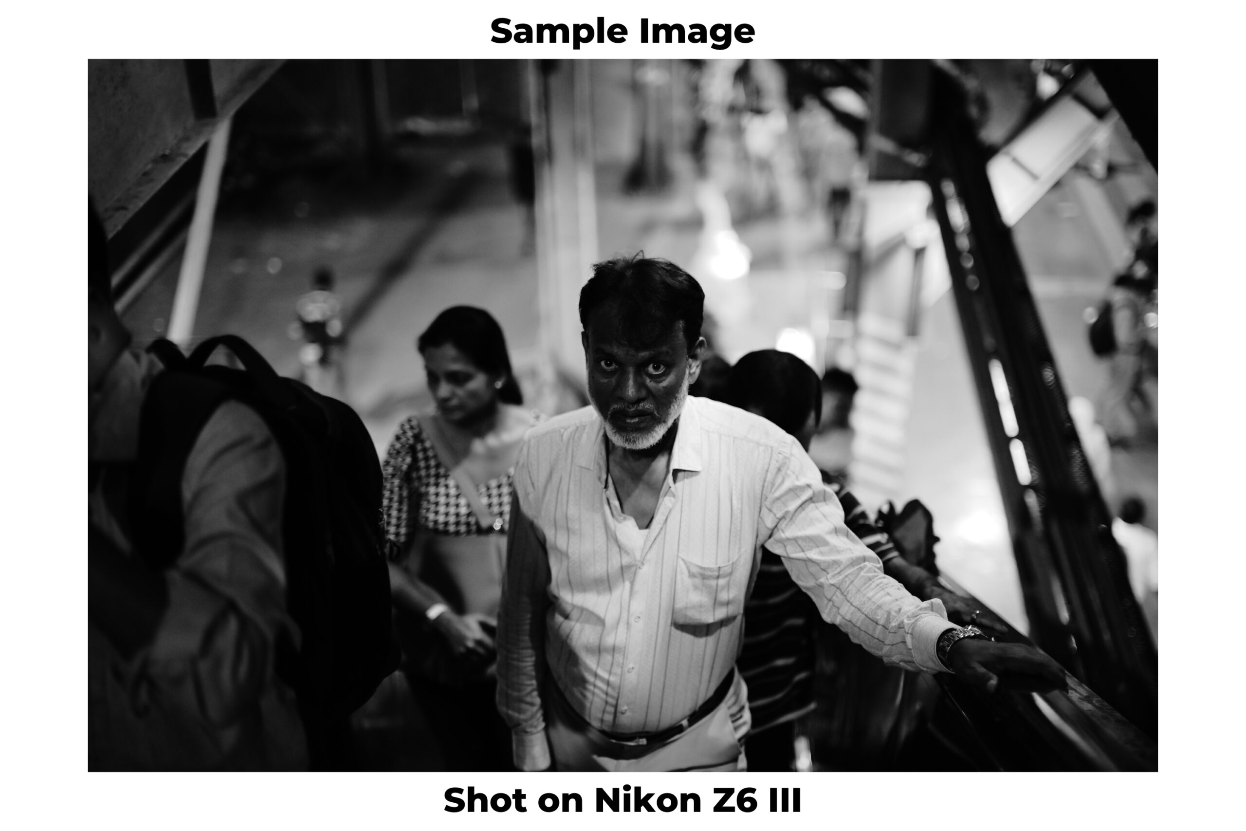
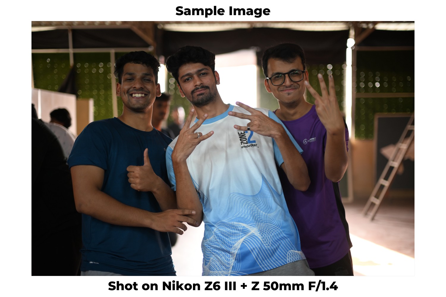
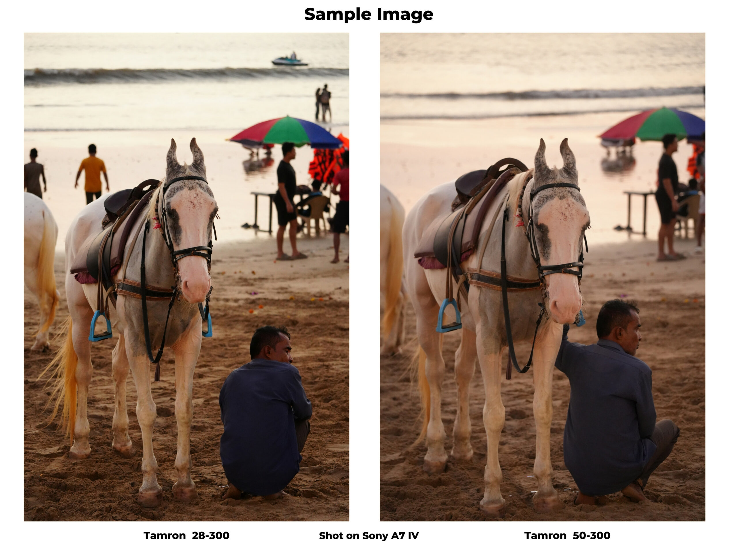
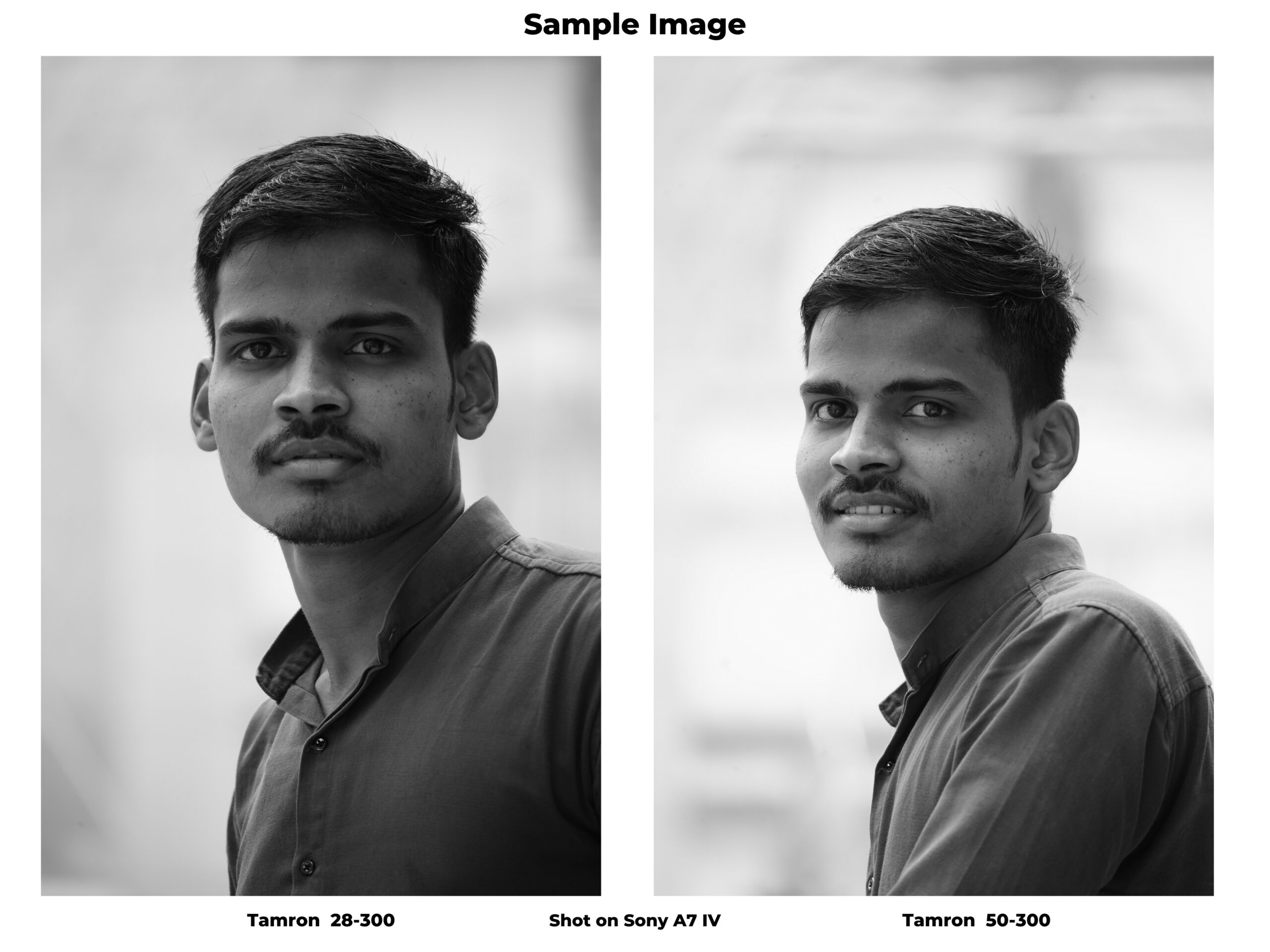
Nikon recently launched the new 28-400 mm lens for its full frame Mirrorless Z range of cameras. The lens is priced at Rs. 1,28,995 and it comes in the all-round superzoom category. Now the reason why I call this lens an all-round lens, because it can go as wide as 28mm all the way upto 400, making it a very versatile lens to use.
But the important questions here is – who is this targeted to? It’s targeted to someone who is an amateur wildlife enthusiast, street photographers, may be sports, although it isn’t fast enough for that.
Look, Body and Feel
The first thing I notice about the lens is that it is pretty light. This weighs only 725 gms and for a superzoom lens that it pretty light. For this review I am using this with the Nikon Z7 ii and overall it feels like a sturdy package to lug around. At the front you have the 77mm diameter for the lens along with the focus and zoom ring on the lens.
The lens is slightly hard to extend, but over time I feel it will loosen up a little. But there is a lens lock button that is provided to avoid accidental lens creep. I like the build quality of the lens as well, it feels well-built and sturdy. What I am surprised with is the weather sealing, although the specs say that it does feature weather sealing, visibly it is lesser that other lenses that i’ve seen. So this means that the production standard might’ve improved for that to not be visible anymore.
Image Performance
Now with a lens like this where you have the F-stop at F/4-8, it will always be difficult to get the best performance in lowlight, because it won’t allow much light to get in, especially in lowlight scenarios. Another thing to note is that after 200mm, the lens also shifts to an F/8 for shooting.
Now in terms of images in daylight, the performance of the lens is pretty good. At 28mm the pics are sharp, detailed and also are pleasing to the eye. But as you start moving higher in the focal range you can see that the images do have certain softness on the edges and also on zooming in, it will lose some clarity. Now this isn’t something to be surprised about, most lenses in the superzoom category are like that, so this isn’t unusual.
In daylight the focusing is also fast. This lens uses the STM motor, which is the stepping motor to autofocus. It is pretty smooth and quiet, which can be useful when shooting videos. And since it has a longer focal ranges it can be very useful for shooting documentaries. The videos we shot with this were very good (watch video review here), stable and there was quality output. Another good thing that I liked is that the lens features in-built vibration reduction, which works upto 5 stops and the performance of that was also very good.
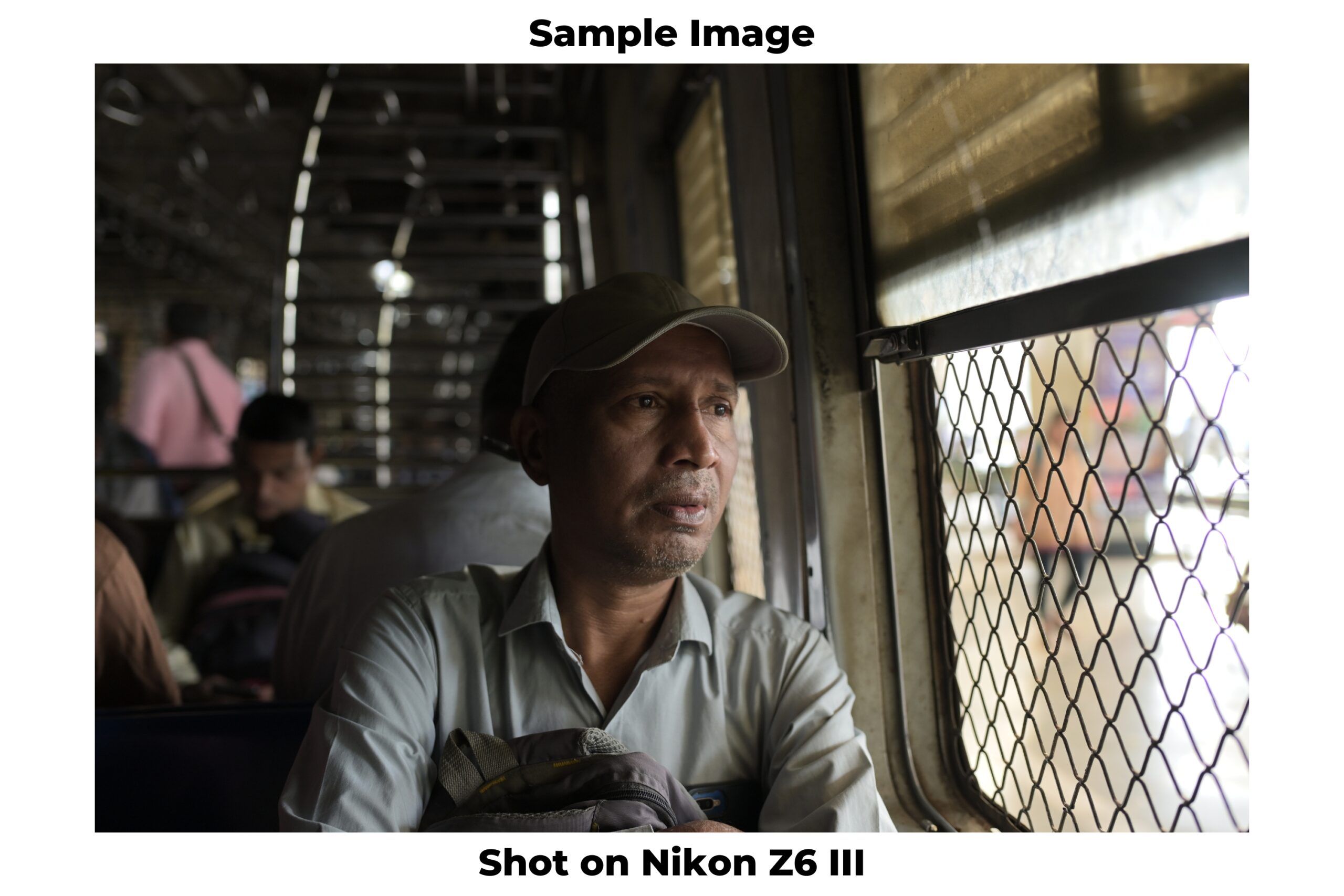
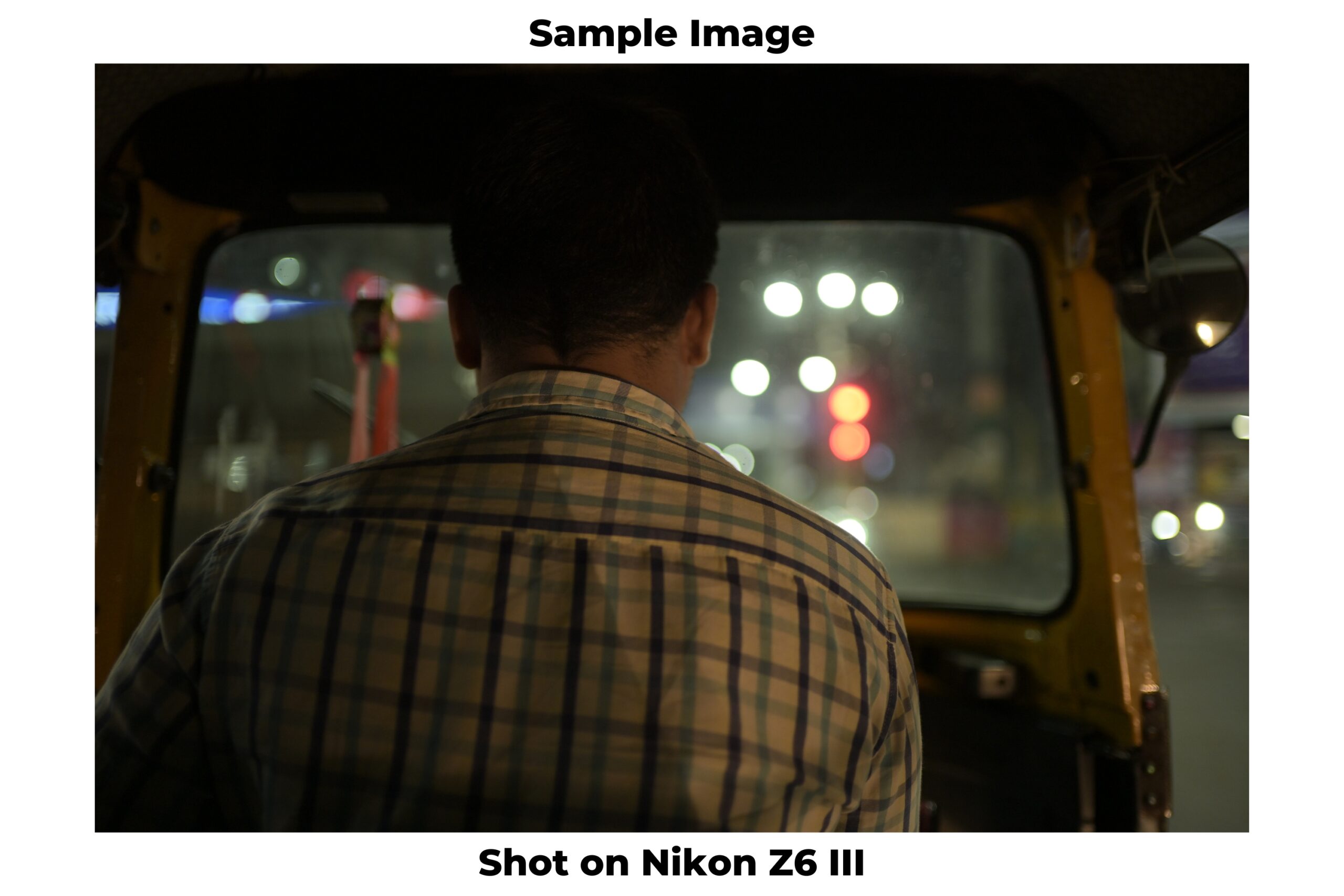
But as good as the lens is in terms of autofocus in daylight, it does hunt slightly in the lowlight conditions. But truth be told I wasn’t expecting the lens to perform very well in lowlight, but I was surprised with the performance. The overall images are good, yes there is a focusing challenge, but when it focuses it delivers good pics. What I like is that with a focal range like this you can use this for street photography also, especially the pics showed good contrast and surprisingly were well lit.
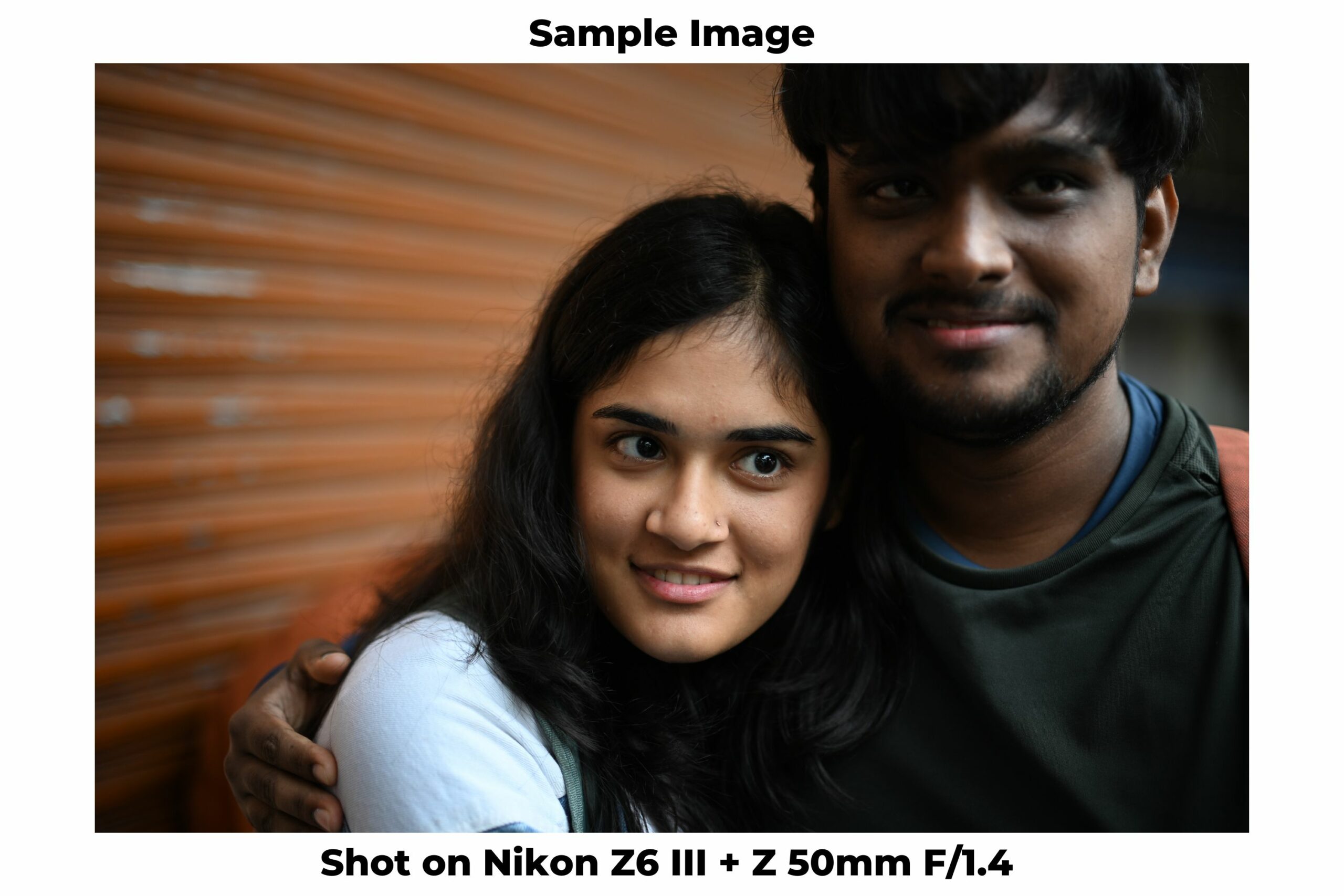
The depth and bokeh as well on the lens were pretty good in both daylight and lowlight.
Minimum focusing distance
For a versatile lens with a superzoom, this lens also gives you the option for getting in closer. The minimum focusing distance of the lens at 28mm is 0.66 ft and at 400mm is 3.69 ft, which is pretty good. The images at both 28mm and 400 mm are pretty decent and I really like the performance in this case. Yes, at the closer range there is surely sharpness at the centre and more softness on the sides. But if used wisely then it can surely be an asset.
Lens flare and ghosting
In terms of the lens flare and ghosting, this is probably one of the best lenses that I have seen in recent times. There is hardly any lens flare of ghosting even when we shot intentionally to test it. The images from the lens under varied scenes don’t show any visible glaring and ghosting and that was something that I was really impressed with.
Chromatic Aberration
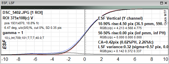
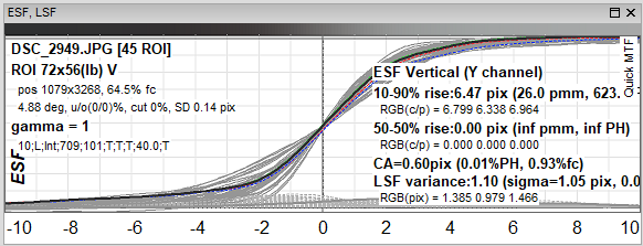
In terms of CA value, the lens does display a value of 0.84 pixels, which is on the higher side.
Conclusion
So how do I find the new Nikon 28-400 mm lens for the Z mount? Honestly my feelings are mixed. Yes it isn’t a lens that will completely blow your mind from the onset. Because it really isn’t a fast lens, which means that you start thinking about its performance, atleast in lowlight. But I was pleasantly surprised with it. The daylight performance is very good, it’s well built and overall gives a good performance. The performance in lowlight could be better though.
But more importantly it gives the user the opportunity to do away multiple lenses at a price of Rs. 1.3 lacs. Which means you don’t have to carry that additional gear. And that to me sounds like a good scenario to be in.
In this review we are comparing the cameras of the OnePlus Nord CE 4 vs Vivo V30e cameras. Both of these phones come in very interesting price category, between ₹25,000 – 28,000. Now this is a very competitive market and also something that users tend to use a lot. Both these phones are the best variants that the manufacturers offer, 8GB RAM and a 256GB capacity which is expandable to 1TB using an external card. The OnePlus is more affordable of the two coming in with a price of ₹27,000, while the Vivo is for ₹30,000.
Camera Set up
At the back both these come with a dual camera set up which are identical, they both feature a 50-MP main camera and an 8-MP ultrawide camera set up. But there are two major differences between them, one the front camera of the Vivo is also a 50 MP camera while the OnePlus is at 16 MP and the other is that the Nord 4 CE is powered by the Snapdragon 7 Gen 1 while the Vivo is powered by the 6 Gen 1 processor. Now to the naked eye this might not seem much, but the processor can make a big difference to the performance of the phones, both in the cameras as well as the overall performance.
Both these are powered by the Android 14 with the layer of Oxygen and Funtouch OS.
Daylight Main Camera
A quick look at the sensors of the camera tells us that both manufactures have used different sensors, the OnePlus uses the Sony Lytia 600 sensor which we have now seen on the Open as well as the 12. While the Vivo uses the Sony IMX 882.
In terms of pics, for a camera which offers 50 MP the performance from both of them is ok. The Vivo in some cases boosts the saturation than the actual scene and giving out more reddish tinge to it. On the other hand, the OP was able to give the output as per the original scene. And because of this compensation, the vivo also boosts the contrast of the image leading to the shadow and highlights being blown out. On zooming in as well the images from the OP are sharper than the Vivo.
We put the phones in a challenging shooting scene with harsh light to see multiple things and in this case as well the Vivo was over saturating the pics and also blowing out some details. If you see the wire in this pic then it has blown out coz of the over compensation. I liked the performance of the OP in this case since it didn’t blow out the sky and made it appear bluish which was slightly dull in the Vivo.
But in cases where you are looking for a better saturation and poppy colours then the Vivo would come out on top with the images looking more pleasing to the eye. Although the flare performance could be better.
Daylight Wide
The wide camera of both the phones comes in at 8 MP and its isn’t the best resolution that you get today. But in this price bracket I don’t think the manufacturers can give you much more either.
The images from both of them are ok. The Vivo again displays signs of over saturation but the performance of the flaring is pretty good in this case, much better than OP. But closer to the actual scene, the OP is able to deliver it much better, the Vivo in this case consistently displayed a yellowish or reddish tinge in most cases. I also found the distortion performance of the OP much better.
Daylight Telephoto
In the telephoto category both the phones allow the user to click upto 2x and then shift to digital zoom of 10x for the Vivo and 20x for the OP.
In this case the performance of both the phones up to 2 to 3x is decent. Anything beyond that I wouldn’t expect a lot. To the naked eye, the OP appears to be sharper on zooming in, but there is hardly any difference between the two honestly. What works for the Vivo in this case is the saturation compensation for vivo which makes some images appear more sharper and pleasing to the eye.
But overall, for zoom purposes and also at high focal ranges the OP is much sharper than the Vivo.
Lowlight Main
In lowlight, the main camera of the OP is again much better giving better sharpness and more saturation as well. The overall image from the Vivo appears to have some sort of a haze due to which the images aren’t looking sharp or saturated. Even on zooming in you can find more details in the pics from the OP. Overall the OP does seem to show a lot more clarity, saturation and also true to scene pics in this case.
Lowlight Wide
And this performance continues in the wide category as well. The Vivo gives a slight reddish tinge to the images while the OP gives a slight yellowing tinge in some cases under ambient light. But under more natural conditions the images from the Vivo seem better than the OP. The images do come slightly underexposed in the OP while they seem well lit and saturated in Vivo.
Lowlight Telephoto
Under this category neither of these phones are that great. At best they are passable.
At 2x the OP displays much better shapes and quality but anything beyond that, both the phones start losing sharpness and in my mind images under such conditions can be used much. As you go higher into the focal range the difference seems more apparent. And in this case as well the OP has a much better quality than the Vivo.
Portraits
In terms of portraits the Vivo gives you the option to use the aura light to shoot more warmer portraits if you want. But the images from that are warmer and the fill of the light can be much better. Also, by default the setting for skin smoothening is on for the Vivo so if you are someone who doesn’t like that then you should put it off in settings.
In general, the images from either of the phones are decent. The output is sharp in most cases, but the edge detection could be better. Now with these types of phones I don’t expect them to have excellent output in terms of bokeh and depth, but in this case as well the OP is visibly much better. The depth is more real and better than the Vivo.
Front Camera
The front camera has quite a bit of difference between both of the phones. The vivo has a 50-megapixel camera, whereas the OnePlus has a 16-megapixel camera in terms of resolution, and the Vivo definitely has an advantage in this case on paper.
But despite the resolution advantage, the images from the OP are well saturated and good. In terms of portraits as well the pictures from both the phones are decent. The have a decent edge detection, especially in backlight scenarios and can be passed at decent images.
Video
When it comes to Videos, both the phones can shoot 4k upto 60 fps and the output from both of them is good. In daylight there is very little to choose between either of them, but in lowlight the OP seems much better than the Vivo. The stabilisation also works better in the OP as you can see from the samples.
Conclusion
So which phone has the better camera? The OnePlus or the Vivo? They both have something that works well for them, but in this case for me the OnePlus Nord CE 4 is the winner, not only because the camera is better under most conditions, but also since it features a much faster processer, specs and also is more economically priced than the Vivo.
The smartphone industry, particularly in the mid-range segment, has become a hotbed for innovation, with camera technology playing a pivotal role. As manufacturers strive to offer premium features at competitive prices, the camera has emerged as a key differentiator for consumers ranging from avid photographers to social media users. We’re examining two new releases priced at ₹69,999 each: The Xiaomi 14, launched in March, and the OnePlus 12, released in January. Positioned below flagship models from Xiaomi and OnePlus, these phones not only compete with each other, but also showcase their prestigious partnerships with iconic camera brands – Xiaomi with Leica and OnePlus with Hasselblad.
In this test, we’ll compare the camera performance of the Xiaomi 14 and OnePlus 12, exploring how these collaborations influence their photographic capabilities. Read the full article to find out which smartphone better suits your photography needs.
8K@24fps, 4K@30/60fps, 1080p@30/60/240/480fps, Auto HDR, gyro-EIS, Dolby Vision
Front Camera
32 MP, f/2.4, 21mm (wide), 1/2.74″, 0.8µm
Auto-HDR, panorama
4K@30fps, 1080p@30fps, gyro-EIS
Daylight Main Camera
In the main camera, both phones are equipped with a 50-MP sensor, but the actual output is what truly matters. In this regard, the OnePlus produces images at 14.3 MP while the Xiaomi 14 delivers slightly lower at 14 MP. However, the Xiaomi 14 might have a slight edge in processing due to its use of the latest Omni Vision sensor, compared to the more established LYTIA sensor in the OnePlus.
When it comes to the quality of pictures, both phones seem to provide good results. The images appear sharp and detailed to the naked eye, making it hard to prefer one over the other. Upon closer inspection, however, the OnePlus photos tend to be slightly more saturated, giving them a reddish tinge. Conversely, the Xiaomi produces images that are more natural and true to the original scene. Additionally, the Xiaomi shows superior performance in handling glare, successfully reducing it in most instances where the OnePlus might display some glare. The handling of highlights and shadows by the Xiaomi is also commendable; thanks to a balanced tonal range, it manages to reveal more details in the images.
Daylight Wide Camera
Regarding the ultra-wide cameras, the OnePlus employs a 48 MP Sony IMX581 sensor, while the Xiaomi 14 uses a Samsung ISOCELL sensor. The actual output from the Xiaomi is approximately 14 MP, and the OnePlus produces an output of 13.2 MP. In this aspect, Xiaomi has a clear advantage.
The difference is also visible in the quality of the images. Xiaomi’s images show more natural whites compared to those from OnePlus. However, despite having a lower megapixel count, OnePlus excels by delivering sharper images upon zooming. This suggests that OnePlus has very effective backend processing, though its images are slightly more contrast, which could be a disadvantage.
In indoor settings, Xiaomi occasionally produces images with slightly more contrast than OnePlus, which was unexpected. Moreover, OnePlus images sometimes appear to have a reddish tinge.
Daylight Telephoto Camera
When it comes to telephoto capabilities, the two phones use different sensors. The Xiaomi is equipped with a Samsung ISOCHELL 50 MP sensor that produces a 14 MP output, whereas the OnePlus has a 64 MP OmniVision sensor with an output of 17.6 MP. Their zoom capabilities also vary. The OnePlus offers a zoom range of 3x and 6x, extending up to 120x, while the Xiaomi provides zoom levels of 3.2x, 5x, and 10x, with a maximum of 60x.
The OnePlus has a higher sensor resolution, which results in sharper images across its entire range. As the zoom level increases, the difference in sharpness between the two phones becomes more apparent. For those who prefer sharper images, the OnePlus would be the better choice. However, when it comes to overall image quality, especially at high zoom levels, there is little to distinguish between the two phones as both generally produce good results. Nonetheless, the OnePlus shows some inconsistency in tonal range as the zoom increases, an issue that is not present in the Xiaomi. The Xiaomi may not capture the sharpest images, but it maintains more consistent quality.
Lowlight Main Camera
Recently, there has been an increase in people taking pictures in low light settings, such as during dinners and social outings. In these situations, the Xiaomi’s performance is comparable to the iPhone, as it tends to produce more neutral and natural images. On the other hand, the OnePlus tends to saturate the pictures, which might be preferred by some users because it makes the colours more vivid, and many people like such vibrant pictures.
When it comes to details and sharpness, both the Xiaomi and the OnePlus perform similarly, though the OnePlus might have a slight advantage.
Lowlight Wide Camera
In terms of performance in low-light conditions, both cameras are decent. However, the OnePlus tends to oversaturate the pictures more than the Xiaomi, affecting the visibility of shadows and highlights. Despite this, the OnePlus still produces sharper images in this category.
It’s important to note that the overall performance of both phones varied. Sometimes, the Xiaomi’s images were overexposed, while at other times, the OnePlus’ images were underexposed. Therefore, neither phone delivered flawless results in this segment.
Lowlight Telephoto Camera
Much like its performance in daylight telephoto shots, the OnePlus produces a much sharper image. As one zooms in further, this becomes more evident. At the maximum zoom range of each phone, the images tend to be blurry, yet they appear significantly clearer on the OnePlus.
Although it was anticipated that the OnePlus might display varying colour tones in this aspect, the actual performance was surprisingly better than expected.
Portraits
Xiaomi has consistently performed well in portrait photography over the years, and this was also true for the Xiaomi 13 Pro, which received positive reviews. The brand’s portrait mode, although good, takes a unique approach by incorporating Leica filters, which might be confusing to new users who could initially think there are only two shooting options available.
Both Xiaomi and OP deliver high-quality images that are sharp, well-saturated, with good edge detection and bokeh effect. However, Xiaomi’s portraits are particularly appealing, especially in how they handle skin tones, making them appear more natural, saturated, and warm, thus pleasing to the eye. In contrast, OP offers better blur and sharpness, especially at higher focal ranges, but sometimes struggles with inconsistent tonal ranges.
Front Camera
Both phones feature a 32-megapixel front camera; however, the OnePlus offers only a single setting for taking pictures, while the Xiaomi 14 provides options for both wide-angle and standard (1X) shots. An interesting feature of the Xiaomi 14 is that it uses a timer when the volume down button is pressed to take a picture.
In terms of image quality, the OnePlus produces more natural-looking photos, whereas the Xiaomi enhances the exposure to make the images appear more striking. The Xiaomi 14 also has skin smoothing turned on by default, which users may want to disable for a more natural appearance. When capturing portraits, both phones deliver good detail and edge detection, but the Xiaomi slightly outperforms in terms of the sharpness of the details.
Video Performance
Both phones can record video up to 8K at 24 fps, though this feature has not been tested as it is unlikely to be used frequently by most consumers in the near future. When recording in 4K, both devices can shoot up to 60 fps. In this mode, the OnePlus generally produces better videos. Video stabilization is effective on both devices, but the Xiaomi tends to display more contrast, which can make some videos look underexposed. This was observed with HDR turned off as well, and some glare was noticeable in the videos shot with the Xiaomi 14.
In low-light conditions, however, the increased contrast in Xiaomi’s videos results in better visual quality. Additionally, the Xiaomi outperforms the OnePlus in terms of flare handling in these settings. It is also worth mentioning that Xiaomi’s sound recording quality is superior.
Overall, the OnePlus is favoured for its better overall performance.
Conclusion
Which phone has the better camera, the Xiaomi or the OnePlus? In this comparison, the Xiaomi 14 seems to have the advantage. It captures neutral photos under most conditions, which is highly appreciated. Additionally, it produces warmer-looking portraits, which seems to be popular among users. Although it doesn’t perform as well as the OnePlus in video recording, its superior macro capabilities contribute to it having a better camera overall.
The choice might differ if considering the overall quality of the phone, where factors like the operating system, usability, and display come into play. However, it’s worth noting that the Xiaomi 14’s user interface has improved significantly with the introduction of Hyper Touch OS. Expectations are that it will continue to get better with future updates.
Instant printing cameras offer a unique blend of nostalgia and modern technology, allowing users to capture and print photos instantly. These devices cater to a wide range of consumers, from photography enthusiasts who appreciate the tangible feel of printed photos to younger generations seeking the novelty and immediacy that these cameras provide. The new Instax PAL from Fujifilm is interesting because it’s different from other instant cameras. It costs ₹10,999 but doesn’t print photos by itself. You need to buy a separate printer called the Square link for another ₹15,000. If you want the camera, printer, and 100 films, it’s all ₹22,000 together. The camera is really small and has a 5MP camera inside. This setup makes you wonder if it’s really worth buying because it’s quite expensive and you need to buy extra things to get it to work fully. This review looks into the Instax PAL to see if it’s a good deal. It’s not common for an instant camera to need a separate printer, so we’ll see if this camera is still a good choice despite the extra cost and effort.
The PAL is packaged in a small, strong box that even includes a neat little void spot for the warranty. Setting it up with other devices is quick and easy, usually done in just a few minutes. The black colour option looks sleek and stylish, though it can be a bit hard to read because of this. Despite worries about it getting scratched, it holds up well, although it does attract a lot of fingerprints.
Here are three key points to understand about this device:
It comes with a small 1/5-inch sensor and isn’t protected against weather conditions.
On the top, you’ll find buttons for turning it on/off and selecting modes, and at the bottom we have a Link/Fun button that lets you print photos directly to a printer.
The device can be charged with a USB Type C cable, has a spot for attaching to a tripod, and can use a micro SD card for extra storage. It can also hold 50 photos in its built-in memory.
The best part about the PAL is how easy it is to use; it’s practically fool proof. For example, when set in Link mode, it prints straight to the printer without any complicated steps. There’s also a Fun mode for other features. The printing process is straightforward – just a simple action.
Fujifilm has made the PAL more enjoyable by adding small, fun details like custom sounds for capturing photos, and when turning the camera on or off. These little additions are aimed at making the camera more appealing to its target audience, and they do add a charming touch. However, there are a few downsides. The remote display on the phone is of very low quality, though the actual printouts look much better. The printer’s charging port can be tricky to open, and because the camera is point-and-shoot, it’s hard to know exactly what you’re capturing. This can lead to wasting film if you print directly without checking.
Apps
Fujifilm has made a great app for the Instax PAL camera, making it easy and fast to connect. Unlike other apps that can be complicated and put people off, this one is simple and lets you do a lot, like editing photos and making animations. However, you need to download two different apps – one for the camera and another for the printer, which is a bit inconvenient. It would be better if just one app could handle everything. Even though you can print directly from the camera using a special mode, the process involves switching to the printer app to print. This feature could be fun for events like kids’ birthday parties where you want to make special keepsakes for guests. Just remember, transferring a photo from the camera to your phone takes about 15 seconds, and it can take a while if you’re moving a lot of pictures at once.
Results
But what about the photo quality? With a 1.5 MP sensor, don’t expect stunning images. However, using the camera is quite fun. Watching the photo print and slide out brings a unique joy. The picture quality is decent enough for snapshots of family, vacations, pets, etc., perfect for decorating fridges or desks. It’s unclear, though, how often people will use it, considering the cost of paper and media.
A quick tip: After taking a photo and it starts printing, give it a few minutes to fully develop. The photo might not look great right away, but with a little patience, it will improve. Don’t toss it out too soon thinking it didn’t work.
Conclusion
The Instax PAL, priced at 11k, raises the question: Who would buy this, especially when you can get an action camera that’s also small but does more for a similar price? Considering you need to spend an extra 15k for the printer and cartridge, it seems pricey.
However, for those who already own an Instax printer, the PAL could be a great addition. It’s a small, easy-to-carry camera that lets you print photos on your existing printer, meaning you don’t have to carry a big camera on trips.
It seems like the Instax PAL is more appealing to people who are already part of the Instax world. For newcomers, the total cost might not seem worth it just for the experience. But, it’s hard to ignore that this camera is fun and unique to use.
What can be considered as good sound is subjective, but with the slew of phones getting launched in the budget category, earbuds are also a category that has heated up in the past few years. OnePlus, who entered this segment a few years back have had some products that’ve done well in the market, while others that haven’t. They recently launched the OnePlus Buds 3 at a price of ₹5,499, which offers features that aren’t available in this segment. Does it deliver a punch in this segment? Let’s find out.
Design and Specs
The OnePlus Buds 3 are available in Metallic Grey or Splendid Blue, featuring a metal construction with a dual matte plus glossy finish that strikes a balance between style and subtlety. These stem-cell design buds offer IP55 rating for water and dust resistance. Their stems are slightly curved inwards and with the rubberized ear tips, they are comfortable for prolonged periods.
The stems are equipped with capacitive touch controls, allowing users to swipe up or down to adjust the volume, tap once to answer calls or skip tracks, and long-press to switch noise cancellation modes. However, they lack a default gesture for pausing or playing music, which can be customized Bluetooth settings on OnePlus or Oppo devices. The touch controls on the OnePlus Buds 3 are responsive and reliable, although they can be a bit unresponsive at times.
The design of the case is similar to the Pro series and features the OnePlus logo, pairing button and the Type-C charging port at the back. Each bud weighs approximately 5 grams, with the case contributing an additional 40 grams.
In terms of technical specifications, the Buds 3 are equipped with 10.4mm dual drivers and support Bluetooth 5.3, along with the LHDC 5.0 audio codec, in addition to standard SBC and AAC codecs, making them compatible with a wide range of Android and iOS devices. They also feature multiple device pairing and Google’s Fast Pair for a quicker connection process with Android devices.
Sound Quality
The OnePlus Buds 3 offer good audio quality, producing a bass-heavy sound with minimal distortion. There’s no need to turn the volume up high to enjoy the deep sounds. Sometimes, they play the deeper and middle sounds too loudly, but they usually work well with musical instruments and the singing sounds quite balanced. It’s advisable to adjust the EQ settings for a better experience across different types of music.
The microphone quality on the Buds 3 is commendable, providing clear call audio even in outdoor environments. This ensures that conversations are easily understandable by the person on the other end.
In terms of active noise cancellation, the Buds 3 perform satisfactorily for their price range. While audio quality is best with noise cancellation off, turning it on significantly reduces background noise. The transparency mode is also effective, allowing for awareness of surroundings without needing to remove the buds.
The Buds 3 excel in syncing audio and video, including high-bitrate content, and their gaming mode reduces latency for a seamless gaming experience. The feature that pauses and plays audio upon removing and reinserting the buds works smoothly, enhancing user convenience.
Battery
The OnePlus Buds 3 boast remarkable battery performance, delivering around 7.5 hours of playtime with Active Noise Cancellation (ANC) enabled. When ANC is turned off, users can enjoy an extra 3 hours of usage. For daily listeners, charging the case once a week suffices. These results are especially notable when using the LHDC codec on OnePlus devices, enhancing the overall listening experience.
Conclusion
For the price of Rs. 5,499 and with offers the OnePlus Buds 3 are a pretty good product. And you can see an improvement in audio quality and tuning as well, indicating that the company is listening to the feedback and also heading in the right direction. Although they haven’t reached perfection yet. The Active Noise Cancellation (ANC) is effective, the microphone delivers clear sound, the earbuds fit comfortably in the ear, and they boast impressive battery life. We give our thumbs up to the OnePlus Buds 3 and surely recommend them for anyone looking for quality earbuds.
The latest addition of the OnePlus watch has been launched after a gap of nearly 3 years with a price of Rs. 24,999. At this price point this watch is competing with the likes of Samsung Gen 4 and Fossil’s Gen 6 watches and the likes of others in that category. Now this isn’t really a premium category watch like your Apple and Samsungs watches. And OnePlus knows that, with this they are trying to target a user that is looking for value for money + premium features and also someone who piggybacks on the OnePlus ecosystem.
Look, Body and Feel
The first thing I notice about the watch is its big dial, a 1.43-inch dial beams out at you with a premium build quality, especially for the price point. And this builds on the IP 68 water resistant rating plus a military grade durability. But while the look is premium the button and rotation dial quality feel average.
The colour is the flagship green, which can be seen on the OnePlus Pad, OnePlus Open, and the OnePlus 12. But at 80 gms the watch certainly feels heavy on the wrist, may be because of the stainless steel build, in comparison the Apple Watch that I use is about 32 gms. The display can go upto 1000 nits and this now also has an improved resolution of 466×466, which is more than the 454 pixels before. It is bright as daylight and you won’t have an issue viewing this under any conditions.
Dual Chipset
To improve the efficiency of the watch it now runs with a dual chipset, one is the Snapdragon W5 performance chipset that runs Wear OS 4, and the other is the BES 2700 efficiency chipset that runs the RTOS operating system. These run concurrently and in most cases I found it to be running smooth and fast. There is not much lag and the watch is able to handle what you throw at it efficiently. Yes, it isn’t lighting fast as I am use to with the Apple Watch, but full points to OnePlus on this one.
Graphics and Animations
But where I feel the let-down are the graphics. When I use the watch, the graphics, the animation, there just seems something missing in them, I can’t put a finger on it, but something is there. And its even more surprising since it features a 60 hz refresh rate, same as the apple watch which is actually pretty good, but for some reason it does feel that fluid. But the Wear OS 4 runs smooth and feels at home with the back button swipes for android, it’s just so intuitive to just do that.
Faces & Customisations
One of the interesting things about a smart watch is its faces, and in this case I found the ones in the O Health app to be limited. But you can download upto 80 more faces online, unfortunately that didn’t work for me since under embargo that didn’t seem to fire up. I do have a bone to pick when it comes to customisations as well. I felt those to be limited as compared to what I am use to with other options. But may be in this price segment this could be offering more?
But the good thing is that with Wear OS 4 now you can get things done easily and also use the google apps on the watch. The watch pairs fast, which is convenient and also will download the apps and access pretty well. But do note that in India specifically Google Pay and Google wallet wont work in India. And also for any iPhone fans, this is not compatible with the iPhones.
A Battery Powerhouse
One of the biggest things that OnePlus is pushing with this is the battery life. And with its 500 mAh battery, this is truly a battery power house. It allows upto 100 hours of battery and also now offers a power saving mode as well. And what’s interesting, in that mode you can get access to loads of basic functions, which lot of the other watches wont allow you to do. For instance, most smart watches just show the time in the power saving mode.
But in any case, if the battery also dies then you just need 10 mins to charge your watch. This comes with a 7.5-watt VOOC Charger, which could be better built honestly, but it supports fast charging and is also more than the usual 2.5 watt industry standard.
Health Apps
Now primarily you always use a watch for its heath features and the OnePlus Watch 2 also offers a host of them. And in most cases they work pretty well. Like for instance it accurately detected the bpm and in both the watches I used and that was pretty close. But the metric of calculating steps seemed quiet off. This does feature the new dual frequency for better precision, but there was surely a mismatch in the steps on both my watches. Now I dont know which watch is really giving the accurate step count honestly, but they aren’t the same. They have also enhanced some of the workout modes as well like the badminton mode, which I am looking forward to using it when my injury heals.
Conclusion
So how do I find the OnePlus Watch 2? Now one of my vices are watches actually, I really love them and I invest in them a lot as well. And for approx. 25k, I think this watch offers a lot and is surely decent. Yes, it isn’t the best at everything it does, but for that you also need to spend a lot more, like the Apple watch, which is nearly 2 times this price.
The way I look at it is that, this watch isn’t the best at everything, but it actually is consistent at everything, and for the price and the features it offers, I can see it being an appealing buy for users.
Welcome to Asian Photography Magazine’s latest smartphone camera review. Today, we’re focusing on the camera capabilities of two recently launched mid-range smartphones: the OnePlus 12R and the Redmi Note 13 Pro+. Both models are priced competitively, with the OnePlus 12R starting at ₹39,999 and the Redmi Note 13 Pro+ at ₹31,999.
Interestingly, the OnePlus 12R hasn’t seen any updates to its camera compared to its predecessor, the 11R. However, it now features the powerful Snapdragon 8 Gen 2 processor and some under-the-hood improvements, which could enhance its camera performance. On the flip side, the Redmi Note 13 Pro+ boasts a significant camera upgrade, moving from a 50 MP to a 200 MP main camera. It also comes equipped with the MediaTek Dimensity 7200-Ultra processor, promising better overall performance.
In this review, we’ll dive into which smartphone offers the better camera experience for consumers looking for quality photography without breaking the bank. Let’s find out which device takes the lead in the mid-range camera showdown.
The OnePlus 12R has a 50 MP Sony IMX 890 camera, while the Redmi Note 13 Pro+ features a 200 MP main camera. Despite these differences, both phones produce images with a similar quality of 12.5 megapixels. The Redmi’s photos look more true to life, and the OnePlus’ photos are brighter and more colourful, which might be more appealing to some people, though I personally prefer the more natural look of the Redmi.
When it comes to how clear and detailed the photos are, both phones are pretty much the same. However, because the OnePlus makes images more vibrant, they can seem a bit sharper. The OnePlus also does a better job with HDR, making photos have better contrast and making colours look warmer and more inviting. Additionally, the OnePlus captures skin tones more realistically, while the Redmi tends to lighten them a bit too much.
Daylight Ultra-Wide Camera
In the ultra-wide camera category, both phones are equipped with an 8-MP sensor and produce images at this resolution. The pictures from both devices are warm, vibrant, and pleasing to look at. However, the Redmi sometimes shows slight colour fringing. On the other hand, the OnePlus occasionally suffers from over-sharpening, leading to a loss of detail in shadows and highlights in some images. Despite these minor issues, the performance of the ultra-wide cameras in both phones is quite similar, leaving little to differentiate between them.
Daylight Telephoto Camera
Both phones, the OnePlus and the Redmi, don’t have a special zoom camera, so they zoom in using their main camera and make the picture smaller to fit. The OnePlus can zoom in 2X, 5X, and 10X, while the Redmi does 2X, 4X, and 10X zoom. Despite this, both phones still produce photos that are 12.5 megapixels in size.
When zooming up to 5X, the OnePlus takes pictures that look warmer and more colourful, but the Redmi’s photos are clearer and sharper. This difference is even more noticeable when you zoom in more. At 10X zoom, thanks to its 200-megapixel sensor, the Redmi captures images that are much sharper and detailed, while the OnePlus photos show a lot of graininess.
Lowlight Main Camera
When it comes to taking pictures in low light, the quality of the photos from the main camera changes a lot compared to daylight. The Redmi’s pictures look yellowish, too bright, and the colours are too warm. On the other hand, the OnePlus takes pictures that look more real and gentle, which makes them nicer to look at. The OnePlus pictures also have more contrast, making them stand out more. However, just like in bright light, the Redmi pictures are sharper and have more details than the OnePlus pictures.
Lowlight Ultra-Wide Camera
In low light, the Redmi’s photos have a yellow tint, while the OnePlus photos lean slightly red. However, the Redmi’s images show noticeable distortion, making the OnePlus the better choice for clearer pictures. The OnePlus also captures colours that look more natural. When it comes to details and sharpness, both phones perform almost the same, offering very similar quality.
Lowlight Telephoto Camera
In low light conditions using zoom, the quality difference between the cameras becomes clearer. The OnePlus doesn’t capture details as sharply as the Redmi does. However, the OnePlus photos look more pleasing and natural, while the Redmi photos have a yellow tint and are more vivid than the actual scene.
Portrait
When it comes to taking portraits, the OnePlus phone does a better job. The pictures are more colourful and vibrant, making them more appealing to look at. They also have a warmer tone, while the Redmi phone’s photos have a slight blue tint. If you zoom in, you’ll notice that the images from the OnePlus are clearer and more detailed. Both phones are pretty good at figuring out where the edges of objects are, though.
In low light situations, the OnePlus phone still takes better pictures, showing off more detail and contrast. The Redmi phone’s pictures tend to have a reddish colour on people’s skin. Also, the OnePlus is better at recognizing edges in these conditions.
Macro
Honestly, I don’t see the point of including a 2-MP macro camera in these phones. It feels outdated, and it doesn’t really add much value. I understand that brands want to offer a triple camera setup at an affordable price, but it would be better if they included features that are actually useful.
From my experience, the image quality from these macro cameras is just average. They’re okay for basic use, but I wouldn’t recommend relying on them for macro photography.
Front Camera
Both phones have a 16 MP camera for selfies. The OnePlus phone takes more natural-looking photos, while the Redmi phone’s pictures look a bit yellow in dim light. Also, the Redmi tends to make skin look smoother in photos, but the OnePlus provides sharper contrast.
Video
When recording 4K videos at 30 FPS with the back cameras, the OnePlus phone clearly outperforms the Redmi. The colours in the OnePlus videos are brighter and more eye-catching. Plus, the OnePlus videos are smoother and have better contrast. On the other hand, the Redmi’s videos sometimes show burn marks, and when shooting in low light, there are noticeable flares and ghost-like effects. Overall, the OnePlus delivers superior video quality.
Conclusion
When comparing these phones, I initially thought the OnePlus 12R wouldn’t perform well in photography because it has the same camera setup as the 11R, especially since the Redmi has introduced an upgraded main camera. However, the OnePlus 12R actually offers more consistent camera performance. Additionally, its software, OxygenOS, provides a smoother and more optimized experience, making it worth the extra cost.
So, if you’re deciding which phone to buy, the OnePlus 12R not only has superior cameras but is also the better choice overall.
Both, the OnePlus 12 and the iQOO 12 launched in December 2023 and January 2024, within a gap of a month. And since the time of these launches, there has been a lot of buzz about their cameras, especially since both of these brands are owned by the same parent company. BBK Electronics owns both, OnePlus and Vivo, and Vivo internally owns iQOO.
And both these devices have a very similar camera set-up, in fact they also use similar sensors and processors as well, making this comparison very interesting. The OnePlus 12 starts at ₹69,999 and the iQOO 12 starts at ₹57,999 and let’s find out which is the better camera between the two.
Look, Body & Feel
The iQOO 12 has been designed in association with the BMW M edition and you can see the reminiscence of that across the design, I really like the weight of the phone, it is really light and you hardly feel as if you are holding anything. But the camera module perspective the iQOO is very simple, they’ve not spent much time in trying to jazz up the module. It pretty much slapping on the module in the black background. The OnePlus on the other hand have some unique things about the 12, like the glitter effect when the light falls on it, also the flowy texture.
I have spoken about that in detail in my review of the OnePlus 12 Review here so you can see that as well.
Now both of the phones come with a triple camera set up and they have been updated of the latest software of Funtouch and Oxygen OS.
In the primary camera both of these have a 50-MP camera but they feature different sensors, the OP12 features the Sony LYT808 sensor while the iQOO 12 features the OmniVision OV50H sensor. But the output from OnePlus is at 14.3 MP and the iQOO is close behind at 13.9 MP. Now why is this important for you to understand. While all manufacturers claim that the phones have a 200-MP camera, 50-MP etc., the output actually it captures isn’t in its full resolution, unless you are activating it. So, these things can be deceptive and often users feel that this is the resolution that the phone shoots at.
To test the phones, I chose a setting where there are shadows, darker areas and also brighter areas so that it pushes the phones to do more and the images from the iQOO were slightly underexposed and over sharpened in most cases, while the OnePlus gives more saturated output. The colour vibrancy is also visibly more on the OnePlus than the iQOO. In terms of the HDR performance, in some cases the iQOO is much better with bringing out the shadows and highlights, while in the other the OnePlus is better. There is also a hint of slight reddish tinge in the images from the iQOO. In terms of sharpness and details both the phones deliver a good performance overall.
Daylight Ultra-Wide Camera
In the ultra-wide category the iQOO shoots with a 50-MP camera at a 15mm focal range and the OP shoots with a 48-MP camera with a 14mm focal range, and the output is bigger also in the iQOO with a 13.8 MP vs the 13.2 MP of the OP.
And in this case the performance was mixed from both the phones, in some cases the OP would be better and in the other iQOO would be better. Neither of them gives a consistent performance that you can really nail. Sometimes the images are underexposed on the OP and sometimes on the iQOO. Sometimes the HDR is better on the OP and other times better on the iQOO.
But like the primary camera, the iQOO again gives hints of reddish tone in them. While the OP 12 continues to give a slightly more vibrant image, which is slightly more saturated than the original scene. In terms of the sharpness and detail they both have a neck-to-neck performance with hardly to choose between them.
Daylight Telephoto Camera
In daylight both the phones feature the same sensor, which is the 64-MP OmniVision sensor, but the zoom capabilities that both of these offer are different. The OP 12 gives a range of 3x and 6x zoom which goes all the way up to 120x. On the other hand, the iQOO gives a zoom of 3x and 10X zoom up to 100x hybrid zoom.
In the images I like the fact that the iQOO gives you a more consistent tonal range across the focal range, which I found the OP 12 to not give. But yes, from the images perspective, both these phones give a good output. There is good sharpness and details in both, but slight over sharpening in the iQOO, especially at the higher focal range because of which the images also seem processed and sharper.
At the max focal range both the phones deliver ok result. You can’t really use these images, but one thing I’d like to mention is that with OP it’s a lot easier to shoot at the max focal range since it locks focus, which is very difficult to do with the iQOO.
Lowlight Main Camera
The performance in the lowlight category from both the phones is very different. When it comes to the primary camera, the results from the iQOO are slightly underexposed and over sharpened. The OP also over sharpens images in some cases, but is able to deliver a more natural and accurate output of the two. But I found the HDR performance of the iQOO to be much better in this case.
Lowlight Wide Camera
In the wide category the images similar to the daylight, both phones had a mixed output. Giving underexposed images sometimes and giving proper natural output the other times. But the images overall seemed more natural from the OP than the iQOO.
Lowlight Telephoto Camera
And much like the daylight performance the lowlight telephoto performance is also varied. You can see the difference in the images and the tonal range between the different focal range. The images are more contrasty and poppy in the OP and the iQOO processes those images more. Now both of these have the same sensors, but the OP delivers a closer to the real look. It’s as if they’ve been able to tweak the processing and signalling much better than iQOO. But the images are sharp and detailed in both phones, however at the max focal ranges you can see the stark difference in the output between both of them.
Macro
While OP has a higher hand in lowlight telephoto, in macro the iQOO with its super macro mode is really good. It allows you to blur the background which the OP won’t do. The images from the OP 12 also come out nice, but with the super macro mode the images from the iQOO are much better.
Portrait
In portraits both the phones allow you to shoot at 1,2 and 3x but the performance varies in both of them. They do deliver sharp and detailed images, but the OP gives a much warmer tone in the images, which might be liked more by the users. The iQOO adds a slight yellow tinge to the subject while the OP adds a slight reddish tinge. Neither of the phones deliver the actual scene in daylight. But in terms of the edge detection in daylight the iQOO is much better, sharper and well defined edges as compared to the OP.
But as good as the iQOO is in the daylight with edge detection, it’s is pretty average overall in lowlight portraits. The images are oversaturated, much too warm and also sometimes at the high focal range shows colour fringing again. The OP in this case delivers an OK performance, the images come slightly underexposed, but much better that the iQOO for sure. So overall in this case I would say the OP is more consistent overall in portraits.
Front camera
And OP is able to continue that in the front camera as well. It has a new 32-MP camera versus the iQOO 16-MP camera which at best delivers an ok performance. The images from the OP are sharper, much better and also is able to deliver more. Even in portrait the camera is able to sense the depth much better. For instance, I took this pic at F1.4 from both the phones and the iQOO gave less depth as compared to the OP. Yes, it does go as wide as 0.95 but even then I thought the depth was ok. In edge detection also the camera is much better.
Video Performance
In video both can shoot up to 8k but the iQOO goes up to 30 fps whereas the OP can go up to 24 fps. The OP also gives you 5 lenses to shoot from as compared to the iQOO.
In terms of output both the phones have a good output, but the samples from OP looks more vibrant and natural, the stabilisation is good in both but it is better in the OP again and overall in the video as well I felt that OP was better.
Other things
Every time that I was shooting with the IQOO the screen would show the live feed much darker than the actual output. That was surprising since there was no way for me to tell if what is the output the camera would show. Also the iQOO was heating up more than the OP as well.
The camera UI is something that I have included in this comparison coz I felt that the fluency of the camera app was better in the OnePlus and also the screen at 4500 nits is just phenomenal.
Conclusion
So which is the better camera between the two? Yes, both of these manufacturers need to work on certain aspects of their cameras even now, but overall in terms of not only the camera, but also the specs, the optimisation of how the phone works overall, OnePlus is the much better camera and phone in most aspects.
The OnePlus 12 was launched recently and this is the 4th year of the collaboration between Hasselblad and OnePlus, which started with the OnePlus 9 series, where they initially had decided to invest 150 million over the next three years in the development of the cameras. Now I have used all the devices since the OnePlus 9 and some of the cameras have been really good and some not. But what’s exciting about this camera is that OnePlus has changed their thought process in this one. Which makes it exciting for the people that were waiting for a phone like this.
Camera Set Up
At first glance you can immediately understand that the cameras of the 12 are much bigger than the 11 and the telephoto lens is different. Also the small touches given to the camera module are interesting, like when the light hits the camera module then you can see that slight glitter with the flowy emerald design also has its touch inside the camera module as well.
Now what’s very interesting about the camera of the 12 is that it is the same set up as the OnePlus Open, except the placements of the camera.
And the phone is powered by the latest Snapdragon Gen 3 processor. The phone that we have reviewed is the maxed-out version with a 16GB RAM and the 512 GB storage. The good thing is that there is a major bump from the cameras of the OnePlus 11, which also had a 50-MP and a 48-MP cameras, but the telephoto was only 32-MP and the front camera was a 16-MP one.
Daylight Wide Camera
The main camera is powered by the 50-MP Sony LYT808 sensor, which is a stacked sensor and it is supposed to let it 25% more light than before. This will give you a 23mm focal range to shoot from and the actual output of this camera is at 14.3 MP, which is better than the 12 MP of the OnePlus Open and the 12.5 MP of the OnePlus 11.
The images from the phone are good. They are sharp and detailed, well saturated as well, but they seem slightly vibrant than the original scenes. In most cases I felt that the colours were really popping out as opposed to what the actual scene was. But yes, in general nothing to complain about the wide camera.
The phone has a new HDR algorithm and we had also kept the HDR setting to Auto, and in this case I thought the performance was ok, nothing different than what I had seen in the previous phones.
Daylight Ultrawide Camera
For the ultrawide the phone offers a 48-MP camera which shoots at 14mm and also doubles up as the macro camera.
The images from the phone are sharp and detailed but the performance is varied and inconsistent. In some cases, the images from the phone are slightly contrasty and in the others, there is a slight reddish tinge as well in them. The colours however are good and saturated and continues the vibrancy in this lens as well. But there is visible distortion in the images that I shot and I wish that all wide lenses would have better distortion performance overall in all phones.
Daylight Telephoto Camera
The 12 has a new 64-MP OmniVision telephoto lens, and it’s the same one that is featured in the Open and also the iQOO 12 as well. This shoots at 70mm on 3x and can go all the way upto 120x as well.
And the images much like the Open are really good. OnePlus has found a great partner in OmniVision for this camera and it really works for them. The images are sharp, well saturated and really detailed. But yes, there is a slight difference in the image from the 2x to 3x. For instance, the images shot at 2x show a different colour while 3x and above show a different colour. But the resolution and sharpness of this lens is really good. And easily the telephoto is the best lens that it has.
Lowlight Wide Camera
In terms of lowlight the performance of the wide camera is good. Much like the daylight it delivers good and sharp images, the images look slightly pushed in some cases, but the output is nice. Infact the shadows and highlights also in this case come out well and the performance of the HDR is pretty good.
Lowlight Ultrawide Camera
And the performance in the ultrawide is also similar. Good output, well saturated images, sometimes they are slightly processed but from the normal perspective they are pretty good. Although underexposed sometimes, the images overall were decent and like most lens in the ultrawide category, the sharpness could be better.
Lowlight Telephoto Camera
Like daylight, the telephoto in lowlight is also pretty good. It delivers consistent performance and also the images are sharp, detailed and well saturated. Yes, on zooming in a lot you will find that the images aren’t sharp, but in most cases you aren’t really going to use that in such cases anyways. Although there were these occasional cases when I saw some colour fringing but that was just one odd occasion and you can surely give it a pass.
Portrait
For shooting portraits, the 12 gives you the option of three cameras to shoot from and honestly, I found the camera to deliver decent results. Across the different focal range, when shooting people, the images showed reddish and yellowish tinge under the same scenarios, the images are also contrasty sometime.
But the edge detection, sharpness and bokeh performance is really good and I am happy that like many phones of today it doesn’t really over sharpen or smoothens your skin. But yes, the performance surely leaves you wanting for more.
Macro
The wide lens also doubles us as the macro lens and the performance from the same is good. It doesn’t have a super macro mode like some of the cameras out there, but the performance from the lens is nice. The colours are vibrant, poppy, may be oversaturated sometimes, but they still look good to the naked eye. Infact I really like the bokeh as well that it was delivering when getting close to the subject.
Front Camera
The 12 features a new front camera in the form of 32-MP and it also now shoots 4k as opposed to the Full HD in the 11.
But where they have given the upgraded camera, it still doesn’t give the option to shoot with wide lens even now. The pinhole camera on the 12 has also moved to the centre instead of the left in the 11, which means you can now look straight instead of the side.
The images from the front camera are good and surely a big upgrade from what it was before and this is a big welcome change that I am happy to see in the 12. And in terms of the video as well the phone now shoots 4k upto 30 fps and that a really good sight to see. The performance is also good as you can see from the image.
Video
In terms of video the phone shoots 8k upto 24 fps and 4k upto 60 fps. The output is pretty good, the phone focuses fast and also the stabilisation is also nice. And in this regard the delivers whatever you ask of it, which is a good overall performance in this category.
Other Things
The phone with the 8 Gen 3 processors and the Trinity Engine is really fast and silky smooth top use. The good thing is also that it doesn’t lag as well when you shoot lot photos with the cameras and in most cases it will keep up to everything that you are doing.
The peak brightness is a whopping 4500 nits, and this thing can literally light up the moon as well. Even in high sunlight you will find its usage to be very easy and that’s a great thing.
Conclusion
So how do I find the OnePlus 12 cameras? Honestly, I have been using the OnePlus phones since a long time and I have mixed feeling reviewing this phone. From a general phone perspective this has the makings of being a good phone for the price, but from the cameras performance, for some reason it is just too inconsistent for me as of now. For instance, the main camera is really good and delivers vibrant pics, but the colour varies from the 2x to 3x cameras.
At the time of this review this phone has not received any update yet, and these are things that can easily be fixed with updates, and OnePlus is known to do that as well. So I am hoping that it gets fixed in time because I would surely like to see the Hasselblad and OnePlus team do much better than this.
Welcome to Asian Photography! Today, we’re excited to compare two eagerly awaited flagship smartphones: The Vivo X100 Pro and the iPhone 15 Pro Max. The Vivo X100 Pro is priced at ₹89,999, while the iPhone 15 Pro Max starts at ₹1,59,900. These are the top models from each brand, showcasing their unique approaches to design and technology. Vivo focuses on high megapixel counts to enhance image quality, whereas Apple prioritizes its software and technology optimization for superior performance.
In this review, we’ll determine which phone’s camera excels across various categories.
The difference in philosophy between the two brands is apparent not just in their cameras, but also in their overall design. Apple opts for a titanium build with a flatter, wider shape, offering a better grip for photography. In contrast, Vivo aims for a sleeker look with a taller, slimmer profile and curved edges.
Moreover, Vivo collaborates with Zeiss, a renowned optics firm, for its camera development, ensuring top-notch quality. Apple, however, develops its cameras in-house, focusing on seamless integration with its hardware for optimal results.
Ultra-wide: 12MP sensor, 13mm equivalent f/2.2-aperture lens, Dual Pixel AF
Tele: 12MP sensor, 1.12µm pixels, 120 mm equivalent f/2.8-aperture lens, Dual Pixel AF
Video: 4K at 60/24fps, 1080p at 60/25fps
Daylight Main Camera
When it comes to the main camera, the Vivo X100 Pro boasts a 50-megapixel sensor, while the iPhone 15 Pro Max comes equipped with a 48-megapixel camera. Here are two key points to note:
Firstly, both smartphones use Sony sensors for their main cameras. The Vivo is equipped with the Sony IMX 989 sensor, a large 1-inch sensor, whereas Apple has opted for the IMX 803 sensor, the same one found in the 14 Pro Max.
Secondly, despite its higher megapixel count, the Vivo X100 Pro processes its images to output at 12.5 MP from its main camera. On the other hand, the iPhone 15 Pro Max uses a technology called stacked pixel binning to deliver a 24-MP image output. This comparison is fascinating because it pits a 12.5 MP image from a larger sensor against a 24-MP image from a smaller one.
Both phones produce high-quality images that are sharp, detailed, and visually appealing. To the unaided eye, the differences between them are minimal. However, the Vivo tends to slightly enhance shadows and highlights, leading to a minor over-sharpening effect in its pictures. Upon closer inspection, images from the iPhone appear clearer due to this. Additionally, in certain situations, the Vivo may show a slight reddish tint in its images, as observed in a specific photo of a plant.
Daylight Ultra-Wide Camera
In the ultra-wide camera category, the Vivo X100 Pro features a 50-MP sensor with a 15 mm lens, whereas the iPhone 15 Pro Max uses a 12-MP sensor with a 13 mm lens. Interestingly, their output resolutions are quite similar, with the Vivo producing images at 12.5 MP and the iPhone at 12 MP.
In this comparison, the Vivo X100 Pro stands out for its ultra-wide shots. Its images are more vibrant and sharper than those from the iPhone. The Vivo’s pictures are well-exposed and generally look more appealing than the iPhone’s, which tend to be slightly underexposed and less sharp. Both phones occasionally exhibit a reddish or yellowish tint in their images.
However, when it comes to handling distortion, the iPhone 15 Pro Max performs better. Images of buildings and huts, for example, show less distortion and appear less slanted in the iPhone’s photos compared to those from the Vivo.
Daylight Telephoto Camera
In the telephoto lens category, the differences between the Vivo X100 Pro and the iPhone 15 Pro Max are quite notable. The Vivo uses a 50-MP sensor for its telephoto camera, offering 4.3x optical zoom, which can extend up to 100x digital zoom. It also features floating lens technology, enabling users to take close-up macro shots. Meanwhile, the iPhone has upgraded its telephoto lens in this model, providing a 5x optical zoom with a maximum digital zoom of 25x.
Despite both phones producing images that are well-saturated, sharp, and detailed, the Vivo stands out due to its 50-MP camera and superior resolution, delivering remarkably impressive results that the iPhone struggles to match. However, it’s not a clear-cut victory across all scenarios. At 2x zoom, the Vivo tends to underexpose its images, whereas the iPhone offers more natural-looking results. But as you zoom in further, the Vivo’s images become significantly sharper. This difference in performance becomes increasingly evident at higher zoom levels. At 5x zoom, although the Vivo still tends to underexpose, the sharpness and detail it captures are much superior to the iPhone’s output. By the time you reach 10x zoom, the Vivo’s ability to retain detail and sharpness makes you overlook its exposure issues.
Therefore, it seems likely that users who prioritize detail and sharpness in their zoomed images might prefer the Vivo’s telephoto capabilities over the iPhone’s, despite some of the exposure challenges at lower zoom levels.
Lowlight Main Camera
In low-light conditions, the performance of the main cameras on both the Vivo X100 Pro and the iPhone 15 Pro Max shows varied results. While both cameras produce images that are vibrant and well-saturated, there are instances where the photos may exhibit a reddish or yellowish tint. The handling of shadows and highlights by both devices is commendable, but there are noticeable differences in their approach to image processing. The Vivo tends to over-sharpen its images, whereas the iPhone opts to make them slightly brighter.
Interestingly, in low-light scenarios, the Vivo often delivers a more natural representation of the actual scene compared to the iPhone. This is particularly evident when zooming into the images, where the Vivo’s photos display superior sharpness. This suggests that users who value a more true-to-life depiction of low-light scenes, with an emphasis on detail upon close inspection, might find the Vivo’s main camera to be more aligned with their preferences.
Lowlight Ultra-Wide Camera
In the ultra-wide category, both the Vivo X100 Pro and the iPhone 15 Pro Max exhibit similar performance characteristics to their low-light main camera results. Images from both devices again show a slight reddish and yellowish tinge. Upon zooming in, the Vivo’s ultra-wide images maintain superior sharpness compared to those from the iPhone, consistent with the trend observed in their main cameras.
However, a notable difference in the ultra-wide performance is the level of distortion. The Vivo’s images show more distortion compared to those from the iPhone. This aspect may affect the overall visual appeal of the images, especially in scenarios where straight lines and architectural features are prominent. Users who prioritize image sharpness might still lean towards the Vivo for its detail retention, but those who are sensitive to distortion in their ultra-wide shots might prefer the iPhone’s performance in this aspect.
Lowlight Telephoto Camera
The tendency of the Vivo X100 Pro to over-sharpen its images, which might be seen as a drawback in some photography scenarios, actually becomes an advantage when it comes to its telephoto capabilities. This characteristic enhances the telephoto images, making them sharper and more detailed, particularly noticeable in daylight conditions.
The result is impressively clear telephoto shots that stand out, especially for users who frequently utilize the telephoto lens for zoomed-in photography. This aspect of the Vivo’s performance underscores how its approach to image processing can significantly benefit certain types of photography, showcasing the device’s strength in capturing distant subjects with remarkable clarity and detail.
Macro Mode
The Vivo X100 Pro’s advantage in telephoto sharpness extends impressively into its macro photography capabilities. Thanks to its floating telephoto lens, the Vivo offers a significant benefit: the ability to get extremely close to subjects. Coupled with its super macro mode, the images produced are strikingly well-saturated, sharp, and full of detail.
While the iPhone also supports close-up photography and can capture good quality pictures, it tends to lose focus as you move closer to a subject. This limitation highlights the Vivo’s superiority in macro photography. The Vivo’s ability to maintain focus and detail at very close distances makes it a more suitable choice for users who prioritize macro photography, offering them a level of performance and versatility in close-up shots that is challenging for the iPhone to match.
Portrait Mode
In the realm of portrait photography, the Vivo X100 Pro and the iPhone 15 Pro Max offer different features and results. The Vivo provides users with five focal length options for shooting portraits, whereas the iPhone offers three, giving Vivo users a bit more versatility in how they can frame their subjects.
Image quality from both devices is commendable, but they handle portraits differently. The Vivo tends to brighten the exposure and applies a smoothing effect to skin tones, which might appeal to users looking for a more polished look straight out of the camera. In contrast, the iPhone aims to capture the scene as accurately as possible, reflecting the actual lighting conditions and textures without additional smoothing. This approach may appeal to users who prefer a more natural look.
Upon zooming into the portraits, the Vivo’s images appear sharper than those from the iPhone. Both phones perform well in terms of edge detection, accurately distinguishing between the subject and the background. However, the Vivo slightly outperforms the iPhone in this aspect, with its subjects appearing sharper against the background, enhancing the depth effect typical of portrait shots.
This comparison marks a significant observation. Having used iPhones for many years and comparing them against various competitors, it’s been rare to see another phone outperform the iPhone in portrait photography—a domain where the iPhone has traditionally excelled. Yet, in this instance, it appears the Vivo X100 Pro has not only matched but surpassed the iPhone 15 Pro Max in delivering superior portrait photos. This outcome highlights the Vivo’s exceptional capabilities in this photography genre, positioning it as a strong contender for users who prioritize portrait photography.
Front Camera
The iPhone clearly beats the Vivo when it comes to the front camera. Although the iPhone’s front camera is just 12-MP compared to Vivo’s 32-MP, the iPhone still takes better pictures. The Vivo’s pictures often look too sharp and too bright, making them look unnatural. It even smooths out skin tones even when you turn that feature off. On the other hand, the iPhone captures more natural-looking images, especially in portrait mode. However, Vivo’s photos might look more detailed because of the heavy editing, but the results don’t look as real, especially when it comes to eyes and faces.
Video quality is another area where the iPhone stands out. The Vivo can only record videos in 1080p, while the iPhone can go up to 4K, offering much clearer and better-quality videos. This was also a point I mentioned in my review of the Vivo X100 Pro, highlighting that the front camera definitely needs improvement.
Video
The Vivo phone can record videos in 8K resolution, which is higher than the iPhone’s 4K at 60 frames per second. However, the iPhone excels in other areas like auto-tracking, HDR, and stabilization, making its video quality appear superior. Although the Vivo’s video quality is impressive on its own, it doesn’t quite match up to the iPhone when directly compared. Additionally, the iPhone offers the option to shoot in ProRes format, a feature not available on the Vivo, providing a significant advantage for users interested in higher-quality video production.
Conclusion
When I began this review, I was almost certain that the Vivo would outshine the iPhone in camera performance. However, I’ve been taken aback by how well the iPhone identifies scenes. Surprisingly, despite having lower megapixels in its non-primary cameras compared to Vivo, the iPhone showcases Apple’s strength in harmonizing software with hardware.
Breaking it down: the iPhone takes the lead with its main camera and also excels in selfies and video quality. On the other hand, Vivo wins in the wide and telephoto lens categories, and its macro and portrait shots are outstanding. What gives the iPhone an edge is its user-friendly interface, which many find appealing.
Yet, when considering the cameras alone, the Vivo X100 Pro emerges as the superior choice.