POCO has announced the launch of its latest F-series device, the POCO F7, combining a large battery, slim design, and high-performance hardware.
The F7 features a 7550mAh Silicon Carbon battery—currently the largest in its segment—within a slim 7.99mm frame. It supports 90W fast charging and 22.5W reverse charging. The device is powered by the Snapdragon 8s Gen 4 processor, with an AnTuTu score exceeding 2.1 million. It also includes up to 24GB RAM (12GB + 12GB virtual), UFS 4.1 storage, and an IceLoop cooling system for thermal management.
The phone has a 6.83-inch 1.5K AMOLED display with a 120Hz refresh rate and slim bezels. Other features include a 50MP Sony IMX882 camera with OIS, a 20MP front camera, Corning Gorilla Glass 7i protection, and IP66, IP68, and IP69 ratings.
The POCO F7 will be available on Flipkart starting July 1st, priced at ₹29,999 (12+256GB) and ₹31,999 (12+512GB). First-day buyers can avail up to ₹4,000 in discounts and benefits, including screen damage protection and an extended 2-year warranty.
In an era where wild paint jobs, neon under glows, and eye-popping wraps flood the automotive scene, there’s something undeniably bold about dialling it all back. Monochrome—especially black-and-white—cuts through the noise. It’s not just a colour scheme. It’s a philosophy. Whether you’re restoring a classic, customising a street machine, or designing a next-gen EV, going black-and-white can elevate a vehicle’s presence, simplify maintenance, and sharpen its personality.
This article breaks down when—and why—monochrome matters in automotive work, diving into aesthetics, utility, and the deeper psychology of colour.
1. The Aesthetic Power of Monochrome
From the shadowy silhouette of a blacked-out Range Rover to the clinical sharpness of a white Porsche Taycan, monochrome commands attention without screaming for it. Here’s why it works:
a. Timelessness Over Trend
Fads fade. Black and white don’t. These colours transcend eras, making them a smart choice for vehicles that aim to look relevant today, tomorrow, and ten years from now. The enduring elegance of a black Rolls-Royce or a white Lamborghini Aventador proves the point—style anchored in simplicity never ages.
b. Clean, Modern, Minimal
As car design leans toward simplicity—fewer lines, smoother surfaces, less clutter—monochrome fits right in. High-end concept cars often opt for black, white, or silver to spotlight form and function without visual noise. It’s a visual cue that says “future-forward”.
c. High-Contrast, High-Impact
Black and white used in tandem—think racing stripes, police interceptors, or retro liveries—emphasise geometry, contours, and aggression. The stark contrast gives vehicles a sharp, sculpted, muscular appearance. It’s motion, even at a standstill.
2. Practical Perks of Going Monochrome
It’s not just about looks. Black-and-white schemes can offer serious advantages in daily use, resale, and even technology integration.
a. Hides Wear, Handles Heat
Matte black can disguise minor scratches, road grime, and swirl marks better than bold hues. White cars, on the other hand, reflect sunlight—key in hot climates and important for thermal management in EVs. Both colours are low-key workhorses when it comes to upkeep.
b. Resale-Friendly Neutrals
Monochrome cars—especially black, white, and silver—tend to hold their value better than trendier colours. They appeal to a wider market and are less likely to be seen as polarising. If you’re restoring or flipping a classic, going black or white boosts your chances at a quick, profitable sale.
c. Psychological Punch
Colours affect perception. Black radiates authority, mystery, and prestige—it’s the choice for executives and those chasing power aesthetics. White signals purity, precision, and modernity—favoured in sports and tech-forward vehicles. For many buyers, these associations aren’t just preferences; they’re selling points.
3. Strategic Use of Monochrome in Builds and Restorations
Monochrome isn’t a one-size-fits-all approach. But when it fits, it fits hard.
a. Classic Restorations
For vintage icons like the Ford Model T (famously “any colour as long as it’s black”) or early Porsches, going black or white honours the vehicle’s roots. You maintain historical accuracy while adding a polished, showroom-ready finish that collectors respect.
b. Executive and Luxury Builds
Black has long been the default for sedans and limos that need to project discretion, power, and class. White, especially in pearl or satin, is increasingly popular in the luxury SUV and sports car segments. Both elevate the car without overshadowing it.
c. Performance-Oriented Projects
Track cars, drift builds, and tuner machines often go for stark, high-contrast schemes. A black body with white accents—or vice versa—not only showcases bodywork and aero mods, it makes the car visually faster. In motorsports, perception is performance.
4. Monochrome in the Future of Automotive Design
Black and white are becoming more than classic choices—they’re part of a larger movement in automotive evolution.
a. Simplification Meets Sustainability
White finishes reduce heat absorption, improving thermal efficiency for EVs. Black matte paints, often made with fewer harsh chemicals, are gaining traction among eco-conscious manufacturers. Fewer pigments, fewer complications.
b. Tech-Ready Design
High-contrast surfaces improve visibility for cameras, LiDAR, and other autonomous vehicle tech. Tesla and other EV makers often lean toward minimalist, monochrome interiors and exteriors to reflect the seamless integration of hardware and software.
c. Branding and Identity
For brands, going black-and-white can send a powerful message. Think of Bugatti’s two-tone Veyrons or Singer Vehicle Design’s subtle, bespoke Porsche builds. A refined colour scheme is typically the mark of confidence—a brand that doesn’t need to shout.
Conclusion: When Less is Everything
Choosing black-and-white for automotive work isn’t a lack of imagination—it’s a strategic decision that leans into clarity, contrast, and class. It’s a look that never expires, adapts across genres, and adds value whether you’re racing, restoring, or redefining what a car can be.
Ultimately, monochrome isn’t just a colour palette—it’s a mindset. So the next time you’re building or buying, ask yourself: Do I want my car to blend in or stand tall without saying a word?
Because when it comes to making a lasting impression, sometimes the sharpest statement is black and white.
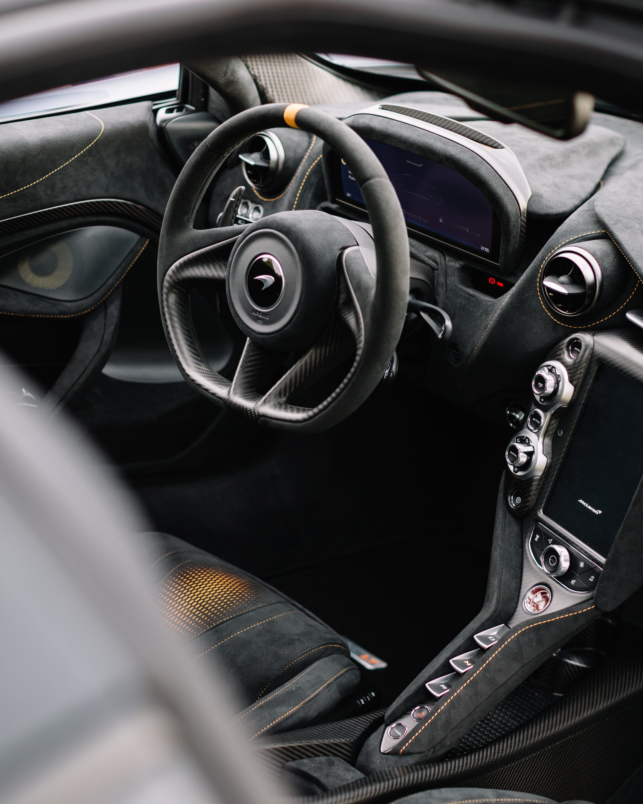
When we think of car photography, we often imagine sleek exteriors, dramatic landscapes, and glossy reflections. But there’s an emerging trend that flips traditional perspectives—interior-first car photography. Instead of showcasing a vehicle’s exterior as the primary focus, this approach highlights the richness of the cabin, its intricate details, and how the outside world interacts with the inside. It’s a refreshing and immersive way to tell a story about a car’s personality, design, and atmosphere.
Why Interior-First Photography?
The interior of a car is where memories are made—road trips, spontaneous conversations, deep thoughts while driving alone, or the joy of simply soaking in the ambiance of a well-designed cabin. Traditional automotive photography typically neglects this space, relegating interior shots to functional views rather than emotional narratives. Interior-first photography changes this by using the cabin as a frame, a lens through which we observe the world beyond.
Key Interior-First Photography Concepts
1. Framing the Exterior Through the Cabin
One of the most compelling ways to capture a car’s personality is by using its windows, mirrors, or dashboard as a frame. Instead of shooting the car against a picturesque backdrop, position yourself inside the vehicle and use its structure to frame the outside.
For example:
Rearview Mirror Perspectives – Capture fleeting moments reflected in the rearview mirror, whether it’s an approaching sunset, a bustling city, or a winding mountain road.
Through-the-Windshield Stories – A fogged-up windscreen in the morning light, rain droplets catching city lights, or the road ahead stretching endlessly—these elements add depth to the photograph.
Side Window Snapshots – Passenger-side compositions, where the window frames passing landscapes, offer a cinematic storytelling approach.
2. Textural and Sensory Details
Car interiors are filled with fascinating textures—from stitched leather seats to carbon fibre accents, warm wooden panels to illuminated dashboard elements. Zooming in on these details creates intimate and luxurious compositions.
Close-ups of Materials – Highlight textures like smooth suede, perforated leather, or brushed aluminium.
Ambient Lighting Effects – Use neon glows from dashboard screens, moody lighting from LED accents, or natural sunlight filtering through.
Hands-in-Action Shots – A gripping hand on the steering wheel, a passenger’s fingers adjusting the radio, a driver shifting gears—these add human interaction to the scene.
3. Natural Light and Shadow Play
Unlike exterior shots that rely on broad daylight or artificial lighting setups, interior-first photography thrives on creative use of natural and available light.
Golden Hour Glow – Sunlight streaming through the windscreen during sunrise or sunset creates ethereal, warm interiors.
Shadow Patterns – The interplay of shadows from the dashboard, vents, and seats adds drama to the shot.
Overhead Light and Mood – Streetlights at night casting subtle highlights inside the cabin offer mystery and intrigue.
4. Passenger Perspective and Lifestyle Storytelling
Instead of shooting a car as an object, interior-first photography works best when capturing experiences. This involves framing moments from a passenger’s perspective, making the viewer feel as though they are inside the car.
Road Trip Vibes – A packed boot viewed from the backseat, maps spread out on the dashboard, or a pair of sunglasses casually placed on the centre console.
Reflections and Overlays – A driver’s reflection on the side window merging with the outside world creates a surreal double exposure effect.
Emotional Connections – Smiles, deep conversations, sleepy road trip passengers, or someone gazing wistfully through a window—these add a human touch.
5. Experimental Angles and Compositions
Thinking outside the box (or in this case, inside the cabin) is crucial for unique interior-first photography.
Over-the-Shoulder Perspective – A driver’s point of view of the road ahead makes viewers feel like they are in motion.
Upside-Down Reflections – Capture reflections from glossy dashboard panels, turning reality into a dreamlike composition.
Fisheye and Wide-Angle Drama – A distorted yet dynamic shot can transform an interior into something unexpected.
Equipment and Technical Considerations
Lenses – A mix of wide-angle, macro, and portrait lenses allows you to capture the interior’s full scope and intricate details.
Lighting – Use natural light as much as possible, but consider subtle LED lights or small handheld flashes for controlled brightness.
Editing – Fine-tune contrasts, enhance textures, and play with colour grading to match the mood—warm tones for cosy interiors or cooler shades for futuristic vibes.
Conclusion
Interior-first car photography is more than just documenting a vehicle’s cabin; it’s about crafting an experience, an emotion, and a journey through the lens of the interior. This approach offers a fresh way to appreciate automotive design and human interaction with cars. Whether you’re a professional photographer or a casual enthusiast, exploring this concept can open up an exciting new perspective on visual storytelling.
Next time you pick up a camera inside a car, consider flipping the script—see the world from the inside out.
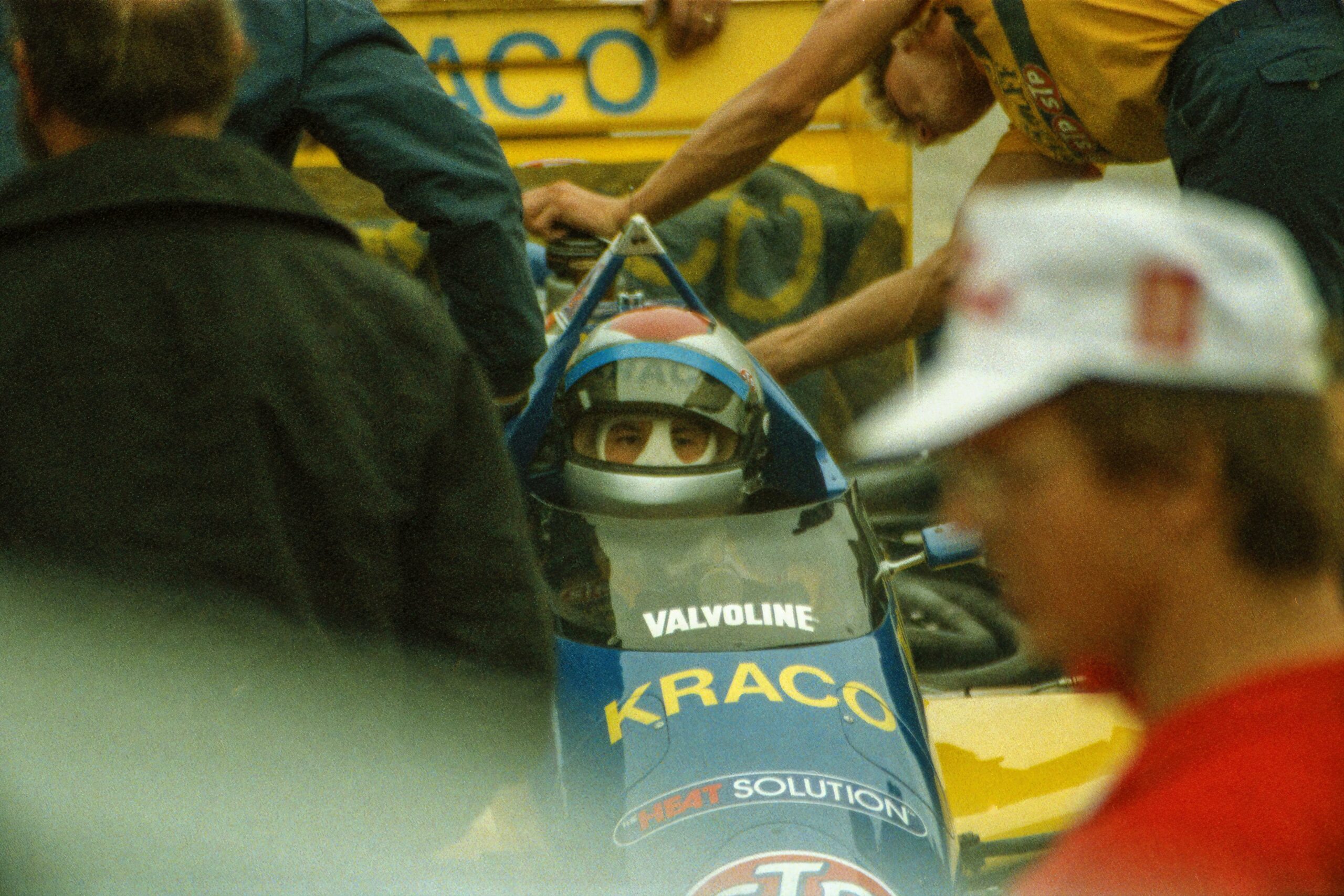
Motorsport is one of the most competitive industries on the planet. If you’re a photographer trying to break in—or level up—you need more than great shots. You require proof that you can deliver under pressure, capture speed and emotion, and elevate a brand’s image. That proof is your portfolio.
Your portfolio isn’t just a gallery. It’s your visual résumé, your pitch, and your fastest way onto a team’s radar. This guide shows exactly how to craft a motorsport photography portfolio that turns heads and opens doors.
1. Know What Motorsport Teams Actually Look For
Motorsport teams live and die by exposure—sponsors, fans, and the media all expect high-impact visuals. Your job is to show you can supply those visuals under real-world conditions.
What to include:
Action shots: Freeze high-speed moments with clarity. Think wheel lift, tire smoke, close packs, pit stops.
Emotion: Capture the human side—mechanics mid-repair, drivers pre-race, celebrations, heartbreak.
Variety: Prove you can shoot in all conditions—night, rain, low light, different race formats.
Storytelling: Include sequences or short sets that tell the story of a weekend or event.
Crowd and sponsor context: Shots that show fans, branding, and the energy of the event environment.
Bonus: Break down your involvement. Mention gear used, planning strategy, any restrictions overcome, and whether your work led to media use, engagement spikes, or sponsor interest.
2. Lead With a Strong Introduction
The first page or screen of your portfolio needs to hit hard.
Include:
A concise bio: Who you are, where you’re based, and what you specialise in.
What drives you: A sentence or two about why motorsport photography matters to you.
Your experience: List key series, events, or teams you’ve shot for.
A sharp headshot (optional): Helps personalise your work in a tight-knit industry.
Clean, consistent branding: Choose a strong typeface, a neutral palette, and a motorsport-inspired design style that matches the tone of your photography.
3. Curate, Don’t Dump
This is where many photographers stumble. Your portfolio should be selective, not exhaustive. If it’s not your top-tier work, it doesn’t belong.
Think quality over quantity:
Only include 15–25 of your strongest images.
Group them by theme or event—e.g., Track Action, Pit Lane Stories, Portraits, Rain & Night.
Avoid repetition. Each image should say something different.
Include at least one full event story set or race-weekend sequence.
Optional but powerful: Add captions with context—track name, car/team, your creative approach. If an image ran in a magazine or generated buzz online, say so.
4. Add Proof and Praise
You’re not just showing your eye—you’re proving your value.
Include:
Testimonials: From team managers, media reps, or fellow professionals.
Client list: Logos or names of series, teams, or publications you’ve worked with.
Media features: Screenshots or links to published work (magazines, websites, press kits).
Social proof: Stats from Instagram Reels, YouTube views, or viral posts—if they exist and relate directly to your work.
Short pull quotes from testimonials add visual interest and build trust.
5. Make It Look Like You Belong on the Grid
Your work is visual, so your portfolio better be, too.
Design principles to follow:
Use high-res images, optimised for fast load times.
Keep the layout clean—white space is your friend.
Use consistent fonts and grid structure.
Avoid clutter—let the photos breathe.
Subtle motion is fine (hover effects, fades), but no gimmicks.
Offer both digital and print formats: website, PDF, and optionally a sleek printed zine or booklet for in-person networking.
6. Show the Work Behind the Work
Teams want people who solve problems under pressure. Add a case study or behind-the-scenes section.
Break down:
The scope of the shoot.
Conditions and challenges (e.g., rain, remote track access, tight deadlines).
Your workflow (prep, shooting, post).
Outcomes—whether a sponsor used the image, it got press coverage, or it became a signature shot.
This shows you’re not just clicking shutters—you’re thinking strategically and delivering under pressure.
7. Make It Easy to Contact You
Your portfolio should be a conversation starter, not a dead end.
Include:
Clear contact info (email, phone, time zone).
Social links—Instagram and YouTube are especially relevant.
A downloadable version or QR code for mobile viewing.
A clean, memorable URL—ideally your name, photo or similar.
Keep your portfolio loaded on your phone or tablet. Tracks and paddocks are full of chance encounters—be ready.
8. Keep It Alive
A portfolio isn’t static. If it hasn’t changed in six months, it’s stale.
Update regularly:
Add recent work.
Replace older shots with better ones.
Keep stats and testimonials current.
Rework the intro as your focus evolves (e.g., shifting from grassroots to pro-level events).
Set a quarterly reminder to refresh it. Momentum is everything in this space.
Final Thought
Motorsport is emotion in motion. The smell of fuel, the pressure of rain, the violence of acceleration—it’s visceral. Your portfolio should make people feel that. Not just admire your skill, but understand your passion and drive.
If you can do that, you’re not just a photographer. You’re someone a team wants on their side.
Users often are unaware of how harmful blue light emitted from a device can be. Dr Chris Bai, Chief Colour Scientist, BenQ Global is responsible for patenting Low Blue Light technology at BenQ and Bhavya Desai spoke to him about its importance, colour accuracy for professionals and what sets BenQ apart from other companies. Excerpts:
You’ve patented and worked on the Low Blue Light technology at BenQ, which is critical. How did that happen?
Over 10 years ago, we observed that blue light’s effects on people’s daily lives. Hence, we introduced the low blue light technology, initially it was the first gen, which eventually turned into the second generation. The difference between the first and second generation is that the latter was a hardware-based solution. We fine-tuned all the LED wavelengths so you don’t get distorted colour temperature. It’s not going to be yellowish, but you still get the benefit of having a good colour and picture quality and more importantly people can have a good night’s sleep.
This was important. In terms of colour science, why are accurate colours important for both a consumer and a professional?
These are two very different aspects we’re looking at. For the consumer, they don’t really care about the colour reproduction because they look at colours from a fashion colour perspective, which are more saturated, more pleasing to the eye. They don’t care if this red or this green looks correct or not.
But a professional cares about these things since they would like to have a correct image in order to reproduce what they really look like. Hence, we have two aspects of the colours currently. One for consumers, where we’re having what we call glazing colour, so that we do some colour adjustment to best represent what we’re interpreting of the colour or the images. But for professionals, we do not make any adjustments on the monitor, which just truly represents what your artwork, what your videos look like. So, it lets professionals do their adjustment
So, this allows them to layer and colour grade the way they want?
Yes and also allows them to interpret the colours the way they want. It is a blank canvas and you do all your creativity on this canvas. And this is the most diffiuclt part for us, because adjusting the monitors is easy, but to do none of it, like it’s a transparent layer, that’s very difficult.
Do you feel consumers prefer more saturated colours?
Well, this is just a preference. Some people will believe in more saturated colours, some people believe in more neutral colours. From my perspective, when we look at those more saturated colours, like the first 10 seconds, we’ll be like wow. But after 30 seconds, you’ll feel tired, you’ll have fatigue, you don’t want to look at it anymore.
But more subtle colours, more natural colours will last longer because you’ll feel it’s more day-to-day life. This is just your take on what kind of premise you’re looking at – If you want to just impress your viewer within the first 15 seconds, then saturated colour is what you should go for. But if you want your viewers to enjoy your video or artwork for a longer period of time, I think maybe go for subtle colours or neutral colours.
How much time does it take for you to make any subtle changes on a display when it comes to the colour science?
This is really hard to put a number on, but I’ll give you a rough idea. To do adjustment on the monitor itself will take me about a month – to do a really good adjustment. But do some fine tuning, I’ll say several weeks. I need to consider all the aspects though.
How difficult is it to replicate that into a mass market product? From a test bench to final product?
Yes, yes, definitely. There will be variance. So that’s why all our professional monitors come with factory calibration. That’s what makes sure that everything’s on the standard platform. And then we add adjustments. And all of our mainstream monitors, we also come with some basic calibration as well.
What are the three USPs that BenQ has?
I think the first is definitely colour. And secondly, we have a complete solution for professional users, which is colour consistency. We have screen-to-screen colour consistency across different devices. That’s a powerful tool for a creative workflow. And third, that we have a really knowledgeable group of colleagues to help professionals achieve the goal they want to.
What is a good standard display from a consumer’s perspective?
We have standards and take measurements to tell the difference between them. For example, the colour temperature definitely should be 6,500K and any large deviation from that, is not acceptable. For example, the gamma curve should be 2.2 or 2.4 in the industry. Anything deviating from that should not be acceptable. So, we do have measures, thresholds, and targets to follow.
OPPO India has launched the A5 Pro 5G, redefining smartphone durability with industry-leading IP66, IP68, and IP69 ratings and Military Grade certification. Extending OPPO’s commitment to ruggedness, the A5 Pro 5G features reinforced double-tempering glass, Sponge Bionic Cushioning, and an aerospace-grade AM04 aluminum frame for superior resistance to drops, water, and dust. It also supports Splash Touch technology for smooth use even with wet or oily hands and glove-friendly operation.
Maintaining the slim, lightweight A Series design, the A5 Pro 5G measures 7.76mm thick and weighs 194g. It offers a 120Hz Ultra Bright Display with 1,000-nits peak brightness for outdoor clarity. Powered by the MediaTek Dimensity 6300 platform and a 5,800mAh battery with 45W SUPERVOOCTM Flash Charge, it ensures fast performance and all-day battery life.
Photography features include a 50MP Ultra-Clear Main Camera, 2MP Portrait Camera, and 8MP Front Camera, enhanced by AI innovations like LivePhoto, Underwater Photography Mode, AI Eraser 2.0, and AI Clarity Enhancer. Connectivity is optimized with AI LinkBoost 2.0, Beacon Link Bluetooth calling, and Ultra Volume Mode for clear audio in noisy environments.
With 48-month Fluency Protection, AI productivity tools like AI Summary and AI Writer, and robust gaming enhancements, the A5 Pro 5G is designed for Indian users who demand reliability, speed, and intelligence from their smartphones.
The OPPO A5 Pro 5G is available in Mocha Brown and Feather Blue colour variants, priced at INR 17,999 for the 8GB+128GB model and INR 19,999 for the 8GB+256GB model.
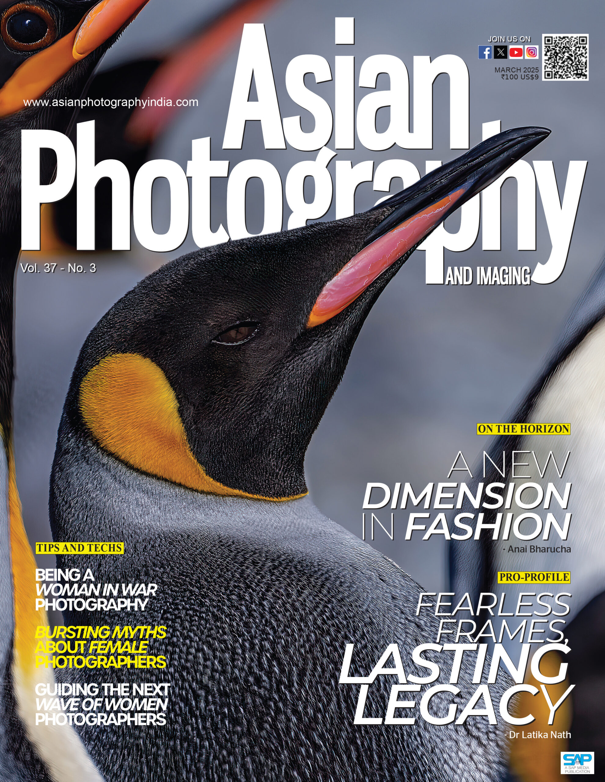
A New Dimension in Fashion – @anaibharucha Fearless Frames, Lasting Legacy – @latikanath Being a Woman in War Photography Bursting Myths About Female Photographers Guiding the Next Wave of Women Photographers
HONOR, a leading global provider of smart devices has officially released the MagicOS 9.0 update for HONOR 200 and HONOR 200 Pro, bringing new features and enhanced security.
This update delivers crucial performance and security enhancements, including the Android February 2025 security patches, and introduces a slew of new exciting AI features like AI Translate, AI Photo Editor, AI Notes.
The Key Features of the MagicOS 9.0 include:
Enhanced Performance and Security: Incorporates the Android February 2025 security patches for enhanced system security.
AI Translate: Real-time interpretation for meetings and lectures. Supports automatic language detection for seamless communication in business and travel.
AI Notes: Voice-to-text and real-time translation. Allows users to automatically transcribe minutes of a minutes, supporting multiple languages and dialects, with a one-click summary feature.
AI Photo Editor – Extract subjects from images, moving photos, and paused videos.
Restore old or damaged faces
Expand images and apply AI-powered filters for creative enhancements
New Gesture Access: Pinch with two fingers on the home/lock screen for personalised space.
Redesigned UI: New icons, cards, and Control Center for a fresh aesthetic.
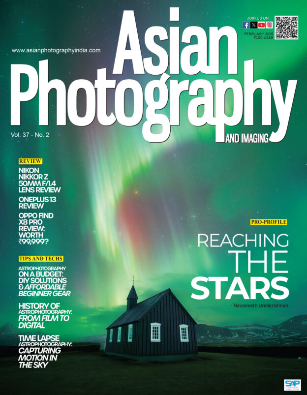
#TechReviews Nikon Nikkor Z 50mm/F4 Lens Review OnePlus 13 Review Oppo Find X8 Pro Review: Worth ₹99,999?
#Astrophotography Astrophotography on a Budget: DIY Solutions & Beginner Gear History of Astrophotography: From Film to Digital Time-Lapse Astrophotography: Capturing Motion in the Sky
Sony India recently revealed Rajeev Gaikwad as India’s National Award winner for the Sony World Photography Awards 2025.
The National & Regional Awards programme is an initiative set up by Sony and Creo under its photography strand the World Photography Organisation to support local photographic communities around the world, with 56 countries taking part this year. Across this year’s Awards over 419,000 images from over 200 countries and territories were submitted to the Sony World Photography Awards 2025.
National and Regional Award winners were selected from the Open competition, which champions the best single images taken in the past year.
Rajeev Gaikwad was anonymously selected by judges for his photograph Phantom Bloom, entered into the Object category of the Open competition. Amidst a vast abandoned waste marble dumping yard in Kishangarh, Rajasthan, a lone tree reaches towards the sky, its bare branches a testament to its resilience. Hanging from the branch, the vivid burst of colour of the two bags introduces a touch of humanity. In this image, the photographer reflects on the delicate balance between nature and human presence in an unforgiving landscape.
Growing up on the surreal outskirts of Aurangabad, Maharashtra, I found inspiration in the dreamlike rural landscapes around me. Photography became my way of preserving moments and telling stories, blending realism with a touch of surrealism. My work focusses on capturing emotions, connections, and the beauty in the mundane. I Always aim to share my unique perspective and inspire others to see the world through a creative and thoughtful lens.
Commenting on his win, Gaikwad said, “Being shortlisted for the Sony World Photography Awards is a surreal and humbling experience for me, I feel completely Blessed. It’s an honor to have my work recognised on this esteemed international platform.
As India’s National Award winner, Rajeev Gaikwad receives Sony digital imaging equipment and will be included in the Sony World Photography Awards exhibition and book.
The overall winners in the Student, Youth, Open and Professional competitions of the Sony World Photography Awards 2025 will be announced on 16 April and will go on display as part of the exhibition at Somerset House, London (17 April – 5 May 2025)
This year’s National and Regional Awards winners are: