The iPhone 17 series is here — and while the regular models got camera tweaks, the Pro lineup takes a major leap forward. All three rear cameras now feature upgraded 48 MP sensors, signalling Apple’s ambitious move in mobile photography yet.
Starting at ₹1,34,900, I’ve been using the iPhone 17 Pro as my daily driver for two weeks, snapping over 500 photos. Here’s what stood out:
Design: A Functional Plateau
Apple calls it the ‘camera plateau’ — and it’s got the internet split. Some love it, some don’t. But there’s no denying that Apple’s sleek design language has shifted toward function over form this year.
The raised module now packs the A19 Pro chip, creating more room for a larger battery, and even a vapour cooling chamber beneath. There’s also an antenna band built into the ridge for stronger 5G reception — and yes, I actually noticed a slight signal boost.
Surprisingly, this chunkier design helps the phone rest flat on a desk. But you’ll likely use it with a case anyway.
Hardware: What’s New Under the Hood
The iPhone 17 Pro’s camera setup brings some serious upgrades:
- Triple 48 MP Fusion Cameras at the back
- 18 MP front camera with a square sensor and Centre Stage
- A19 Pro chip paired with 12 GB RAM
- 4K video at 120 fps, plus ProRes RAW and Genlock
- Updated Photonic Engine for richer colour and better low-light shots.
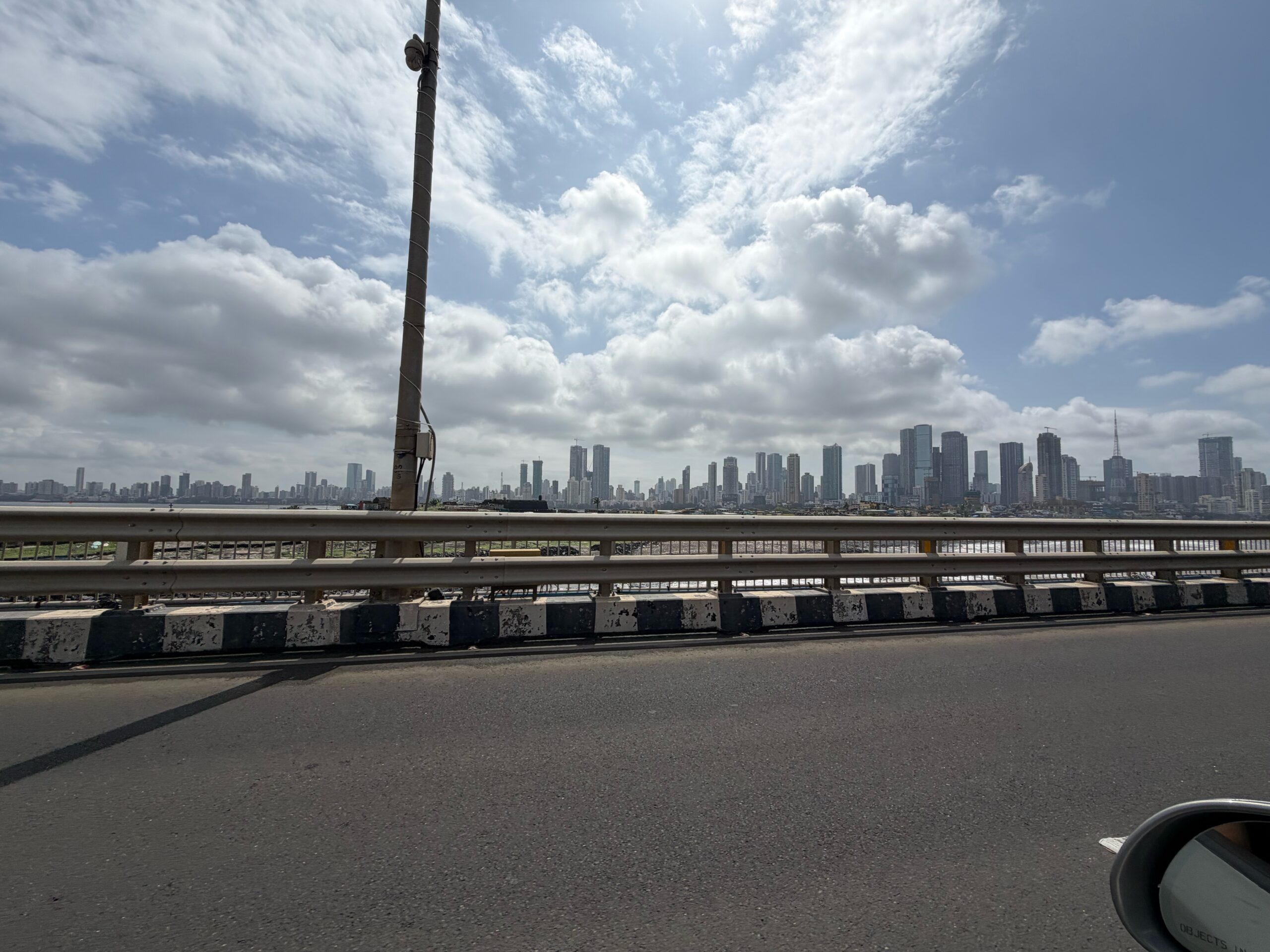
Daylight Main Camera Shines

The primary 48 MP Sony IMX903 sensor outputs detailed 24 MP images, thanks to smart pixel-binning and sensor cropping. Colours are punchy yet natural, contrast is balanced and highlight control is excellent. For the first time, though, I did spot some processing in the images – a first for me. At 2x zoom, resolution drops to 12 MP, and you lose a bit of texture. It’s still solid, but pixel peepers will notice.
Ultra-Wide: A Turnaround
Ultra-wide cameras have traditionally been weakest link for most phones. The 48 MP Sony IMX972 ultra-wide delivers surprisingly crisp images even in tricky lighting. It handles shadows and highlights gracefully, and while there’s mild processing visible up close, overall dynamic range and colour reproduction are good.
Telephoto: The Showstopper
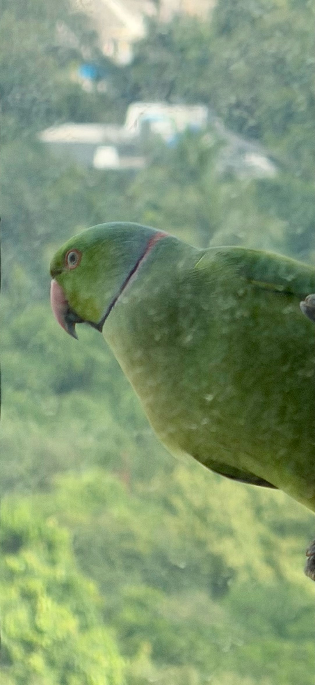
This is where Apple flexes. The new 48 MP Sony IMX973 telephoto sensor is 56% larger than last year’s and offers 4x optical zoom, 8x optical-quality zoom and digital zoom up to 40x.
At 4x and 8x, images are razor-sharp with rich tonality and texture. Even at 20x or 40x, detail retention is decent — though you’ll spot some colour shifting and processing artefacts.
It’s easily the most usable long zoom ever on an iPhone. My only gripe: AE lock could be steadier, especially at higher zooms.
Low-Light Performance

Low-light shots are vibrant, clean and accurate, with minimal visible processing. The main camera captures sharp, noise-free results. The wide sensor holds its own, though fine details fade a little. The telephoto, however, continues to stand out — retaining clarity even at long zooms, something previous iPhones struggled with.
Portraits: Natural and Cinematic

Portrait mode now lets you choose 1x, 2x, 4x, and even 5x. Skin tones look authentic, colours pop naturally, and edge detection is spot-on. Occasionally, I noticed minor skin smoothing and some distortion at 4x, but overall, portraits are pleasing, refined and cinematic – sure to be a hit with the users.
Macro: Detailed but Confused
Macro mode still activates automatically — and sometimes overstays its welcome. It occasionally stays locked in 12 MP mode – due to the minimal focusing distance, even when it should switch back to 24 MP, it doesn’t.
Despite this, macro shots are shockingly detailed, with rich depth and texture that make you forget they’re technically half-resolution.
Front Camera: Smarter, Sharper Selfies

The all-new 18 MP front camera features a square sensor and Centre Stage, which adjusts framing dynamically as you move. Selfies are crisp, well-lit and colour-accurate — with minimal low-light noise.
Apple’s dual capture mode also makes it easier for vloggers to record front and back simultaneously — a thoughtful touch for creators – but it’s not for me personally.
Video: Still the Gold Standard
When it comes to smartphone video, Apple remains in a league of its own. The iPhone 17 Pro shoots 4K at 120 fps, supports ProRes RAW, and can now record directly to external devices for advanced workflows.
Footage is smooth, stabilisation is top-notch (thanks to 3D sensor-shift), and the phone handles heat exceptionally well. There’s still some lens flare and ghosting, but overall, this feels like a mini cinema camera in your pocket.
Battery Performance
With a 3,988 mAh battery, the 17 Pro comfortably lasts a full day — even with heavy photo and video use. The new vapour cooling chamber keeps temperatures in check during long recording sessions or gaming. For creators who push their phones hard, this is a quiet but meaningful upgrade – although coming from a Max it does feel like a compromise.
Verdict
I think the iPhone 17 Pro marks one of Apple’s biggest leaps in mobile photography in years.
Photographs are sharper, colours are truer, and the telephoto system finally delivers usable long-zoom shots.
But there are still some quirks — visible processing in some scenes, occasional colour shifts, and macro confusion — but none are deal-breakers. With improved battery life, cooling and professional-level video tools, the 17 Pro is a capable, pro-grade camera system that fits in your pocket.