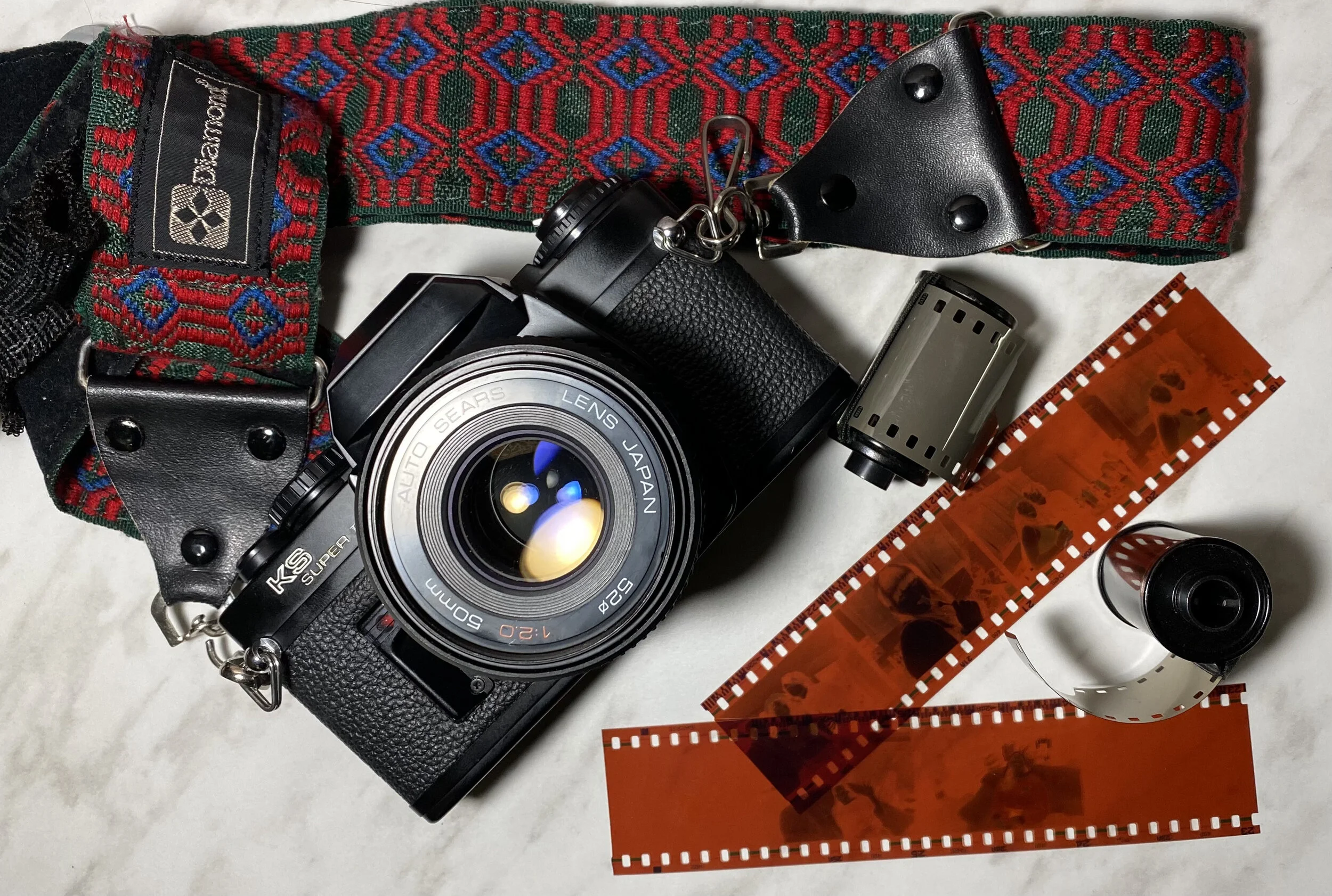
I’ve been writing the annual trends article for the magazine for well over a decade now, and I honestly can’t remember a time when my thoughts felt this unsettled. The last time I found myself in a similar predicament was at the turn of the millennium—around 2000—when analogue photography was clearly on its way out. Digital technology was knocking hard on the door, and no one quite knew what to expect from it, or whether it could truly replace what we had known for decades.
Interestingly, I find myself in a very similar place today while writing this article. I’m not always sure what’s real anymore, what’s manipulated, what’s AI-generated, or even where the line between the two truly lies. More importantly, I’m still unsure how much of this is a passing phase—and how much of it is here to stay. It’s been a while since photography has made even seasoned practitioners pause and recalibrate their thinking this way.
And yet, after careful consideration, observation, and a fair bit of internal debate, here is my list of Trends in Photography for 2026.
- Bhavya Desai
The Dominance of AI in Image Creation & Editing
While AI may feel like a recent disruptor, it has been part of photography for much longer than we realise—earlier disguised as algorithms working quietly behind the scenes. That said, there’s no denying that AI’s dominance in image editing, subject removal, scene expansion and enhancement tools has now reached a tipping point.
AI has firmly embedded itself into the everyday workflow of photographers. Used judiciously, it can be an asset like no other—saving time, enabling creative experimentation and removing technical barriers. From removing unwanted elements to intelligently expanding frames, AI now plays a pivotal role in modern photography.
The sheer level of computing power we now carry in our pockets is staggering—and clearly here to stay. And this is coming from someone who firmly believes in keeping images as untouched as possible. Yet even I find myself regularly using remove tools on devices today. And this is only the beginning. From image generation to increasingly complex creative tasks, AI is rapidly moving towards doing almost everything—whether we’re fully comfortable with it yet or not.
On-Camera Generative AI and Assisted Shooting
Still in its early stages, on-camera generative assistance is another trend that will quietly but surely gain momentum. It’s only a matter of time before photographers—both professionals and casual users—start accepting a certain degree of AI ‘hand-holding’ at the point of capture itself.
This goes beyond simple automation and enters the realm of generative assistance—helping users achieve more with minimal effort. Features such as Google Pixel’s ability to add the photographer into a group photo, or cameras offering intelligent framing suggestions, style recommendations and profile selections, are early indicators of where things are headed. In 2026, expect cameras to become more collaborative tools rather than passive recording devices.

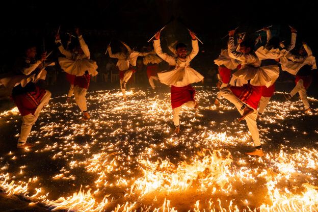
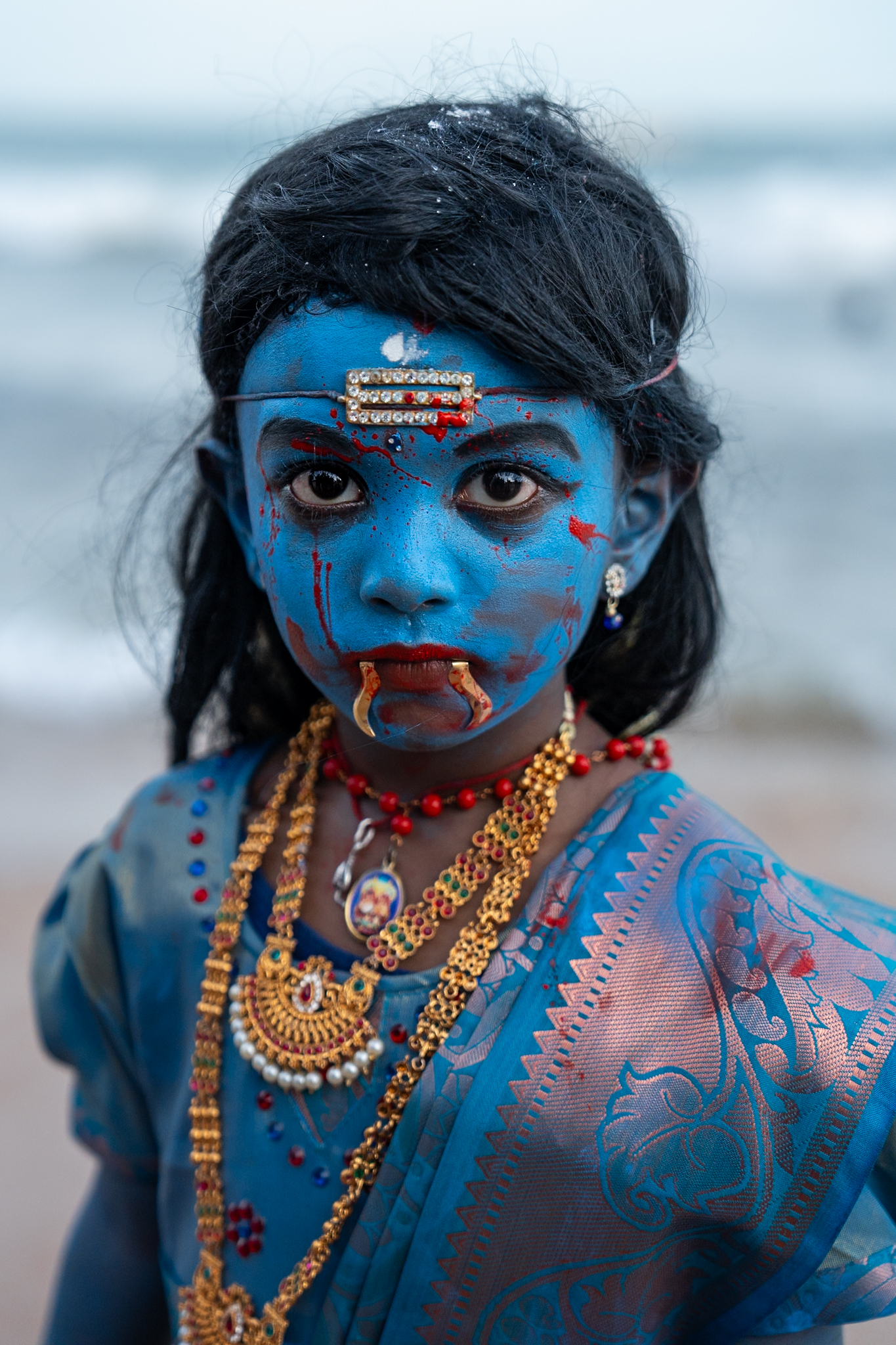
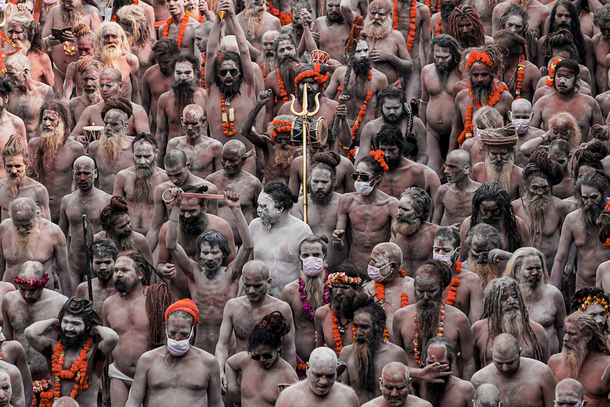
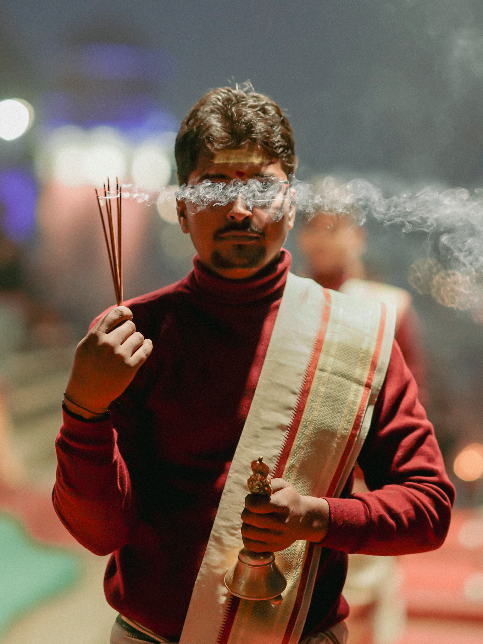
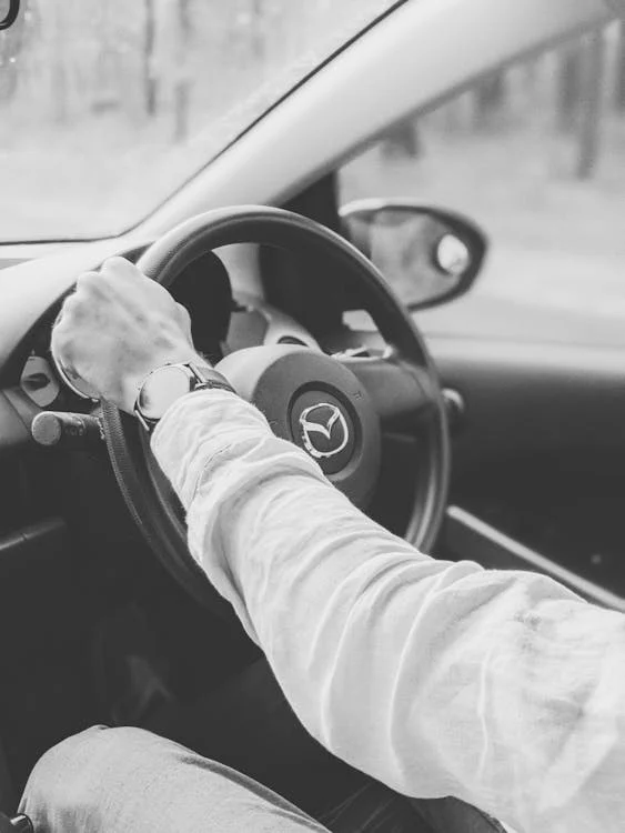
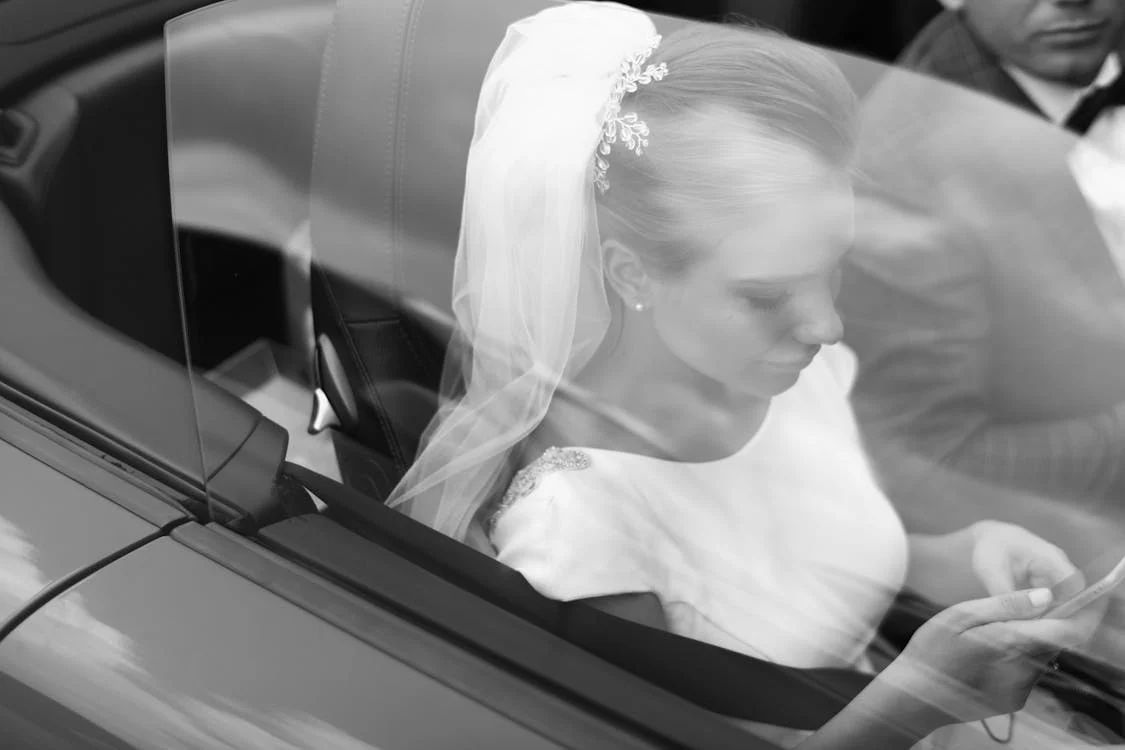
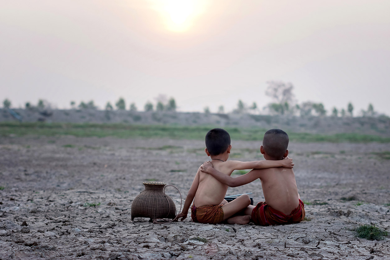
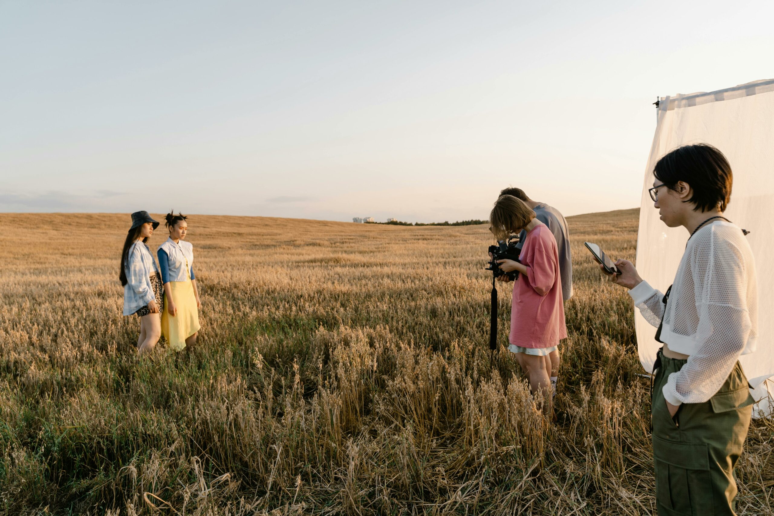
The Return to Authentic Photography
Every action has an equal and opposite reaction—and photography is no exception. As AI-generated and AI-assisted imagery becomes more widespread, the demand for authenticity will grow just as strongly.
In 2026, authentic photography will trend precisely because of AI’s rise. While photographers will continue to push boundaries using technology, there will also be an increasing need for images that feel real—unfiltered moments, honest expressions and unmanufactured realities. As humans, we are inherently wired to recognise and respond to authenticity.
A clear parallel can be drawn from recent years: aggressive skin-smoothing once dominated portrait photography, only to be replaced by far more subtle and natural rendering by 2025. In the same way, I expect 2026 to see a conscious move toward imagery that embraces imperfections and truth.
Climate, Weather & Environmental Photography
As humanity moves into a new technological reality, the planet itself seems to be undergoing dramatic shifts. Few things illustrate this more starkly than the changing climate around us. Winters are colder, summers are hotter, and extreme weather events are becoming increasingly frequent.
Whether termed climate change or global warming, the effects are undeniable. As these realities intensify, climate and environmental photography will play a far more critical role in 2026. From documenting protests and ecological damage to capturing natural disasters and disappearing landscapes, this genre will become both a visual record and a call to action.
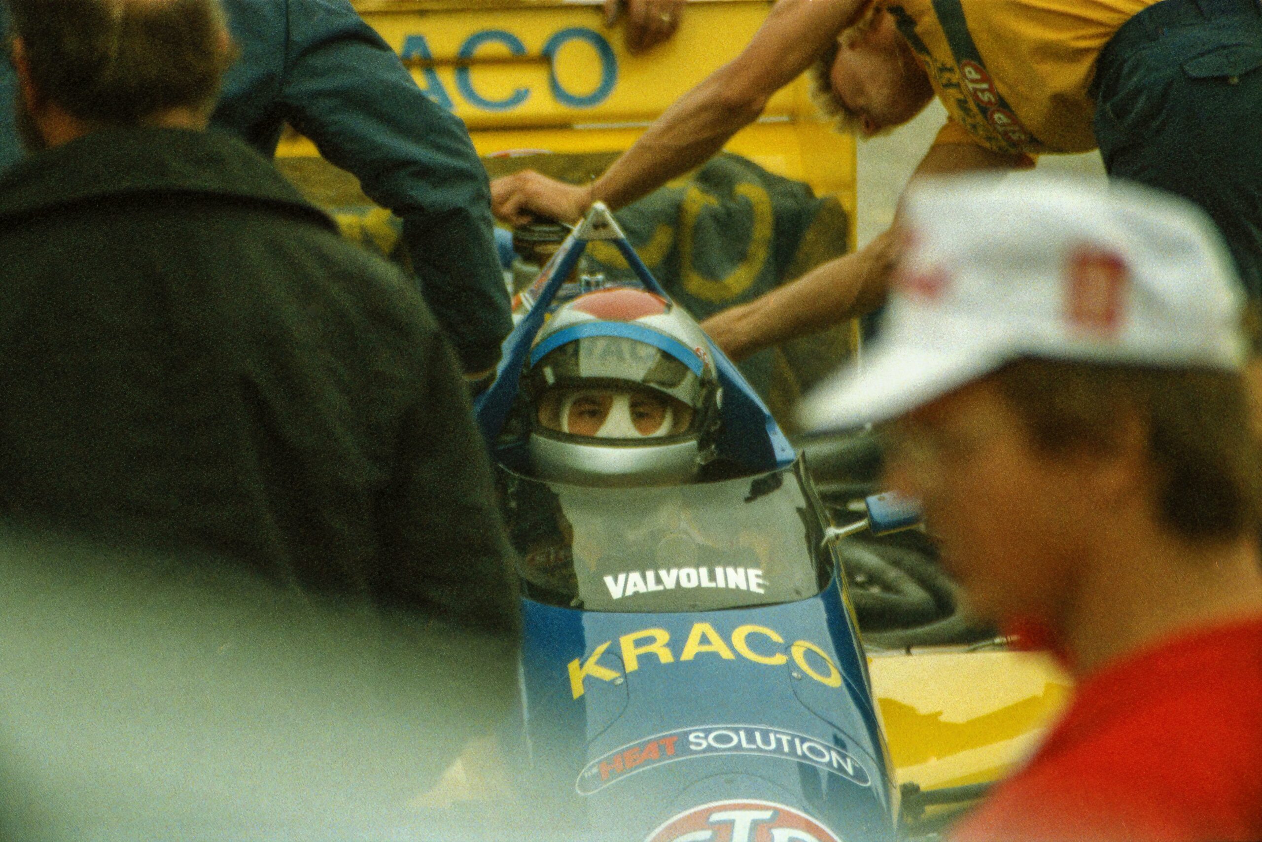
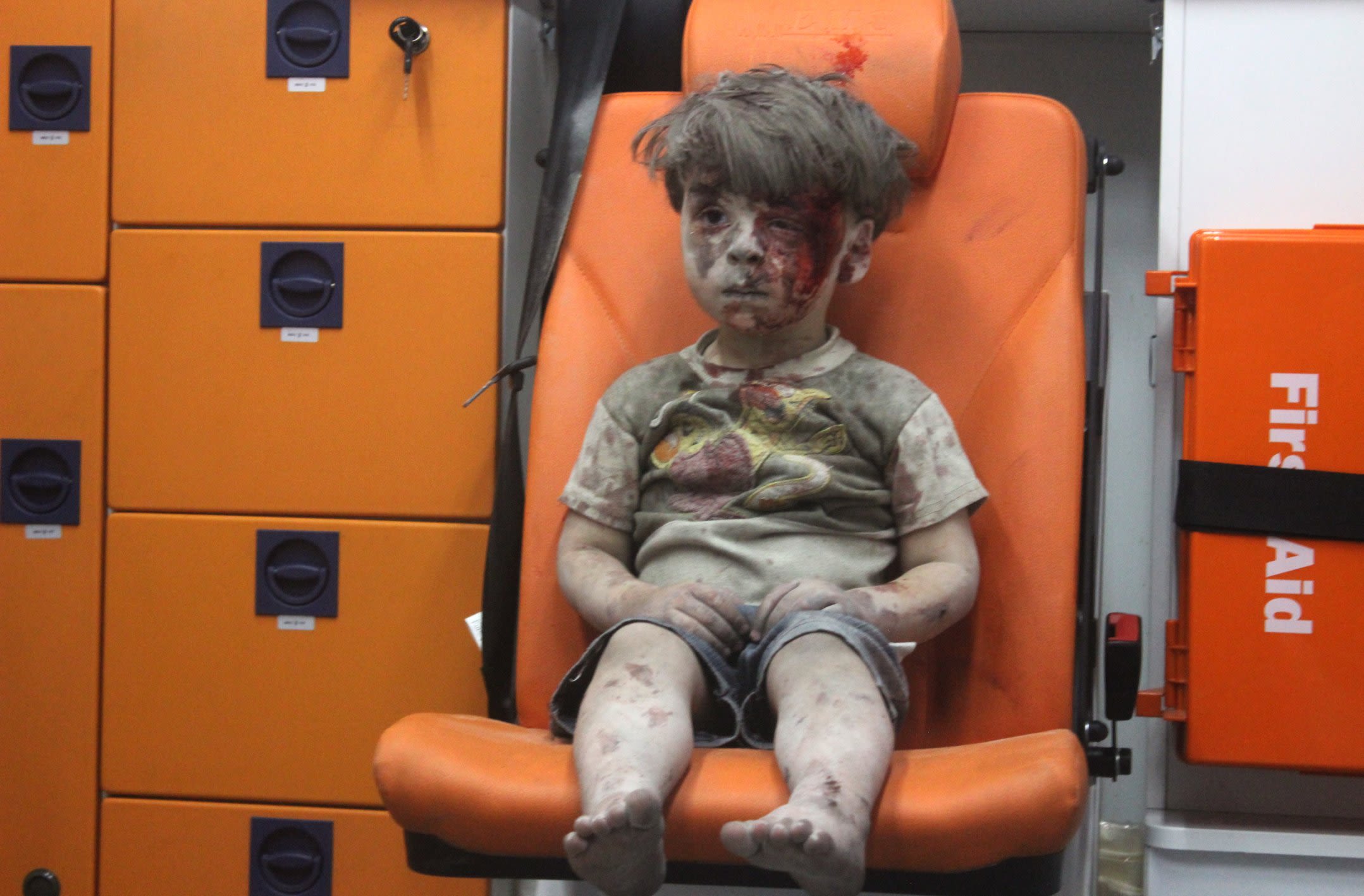
Photojournalism in an Unstable World
While climate documentation will be vital, the broader global landscape remains deeply fractured. Conflicts, political unrest, and social disparities continue to rise across regions.
As a result, photojournalism—particularly editorial and conflict/war photography—will see renewed relevance in 2026. There will be an increasing need to document these realities, whether through professional photographers on the ground or user-generated content emerging from conflict zones. In an age of misinformation, visual evidence will continue to hold immense power and responsibility.
Rising Flash and Memory Costs
The technology industry now faces a fresh challenge. After navigating microprocessor shortages in recent years, attention has shifted to constraints within the flash memory sector.
While this may spell concern for consumers, the flash memory industry itself is witnessing an overdue resurgence. Supply pressures and increased demand are likely to push up prices for flash storage and RAM—components essential to nearly every modern device today, from cameras and smartphones to computers and printers. While quantities may vary, their importance does not.
Photography Beyond the Algorithm
A quieter but meaningful shift is underway. For years, photographers and platforms alike were obsessed with pleasing algorithmic gods. Today, there’s a subtle but growing return to focusing on the medium itself rather than chasing visibility alone.
Photography is increasingly being created for personal satisfaction, long-term relevance and deeper storytelling—not just for instant uploads and fleeting engagement. That said, vertical images are undeniably here to stay. Formats may evolve, but intent is clearly changing.
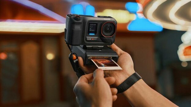
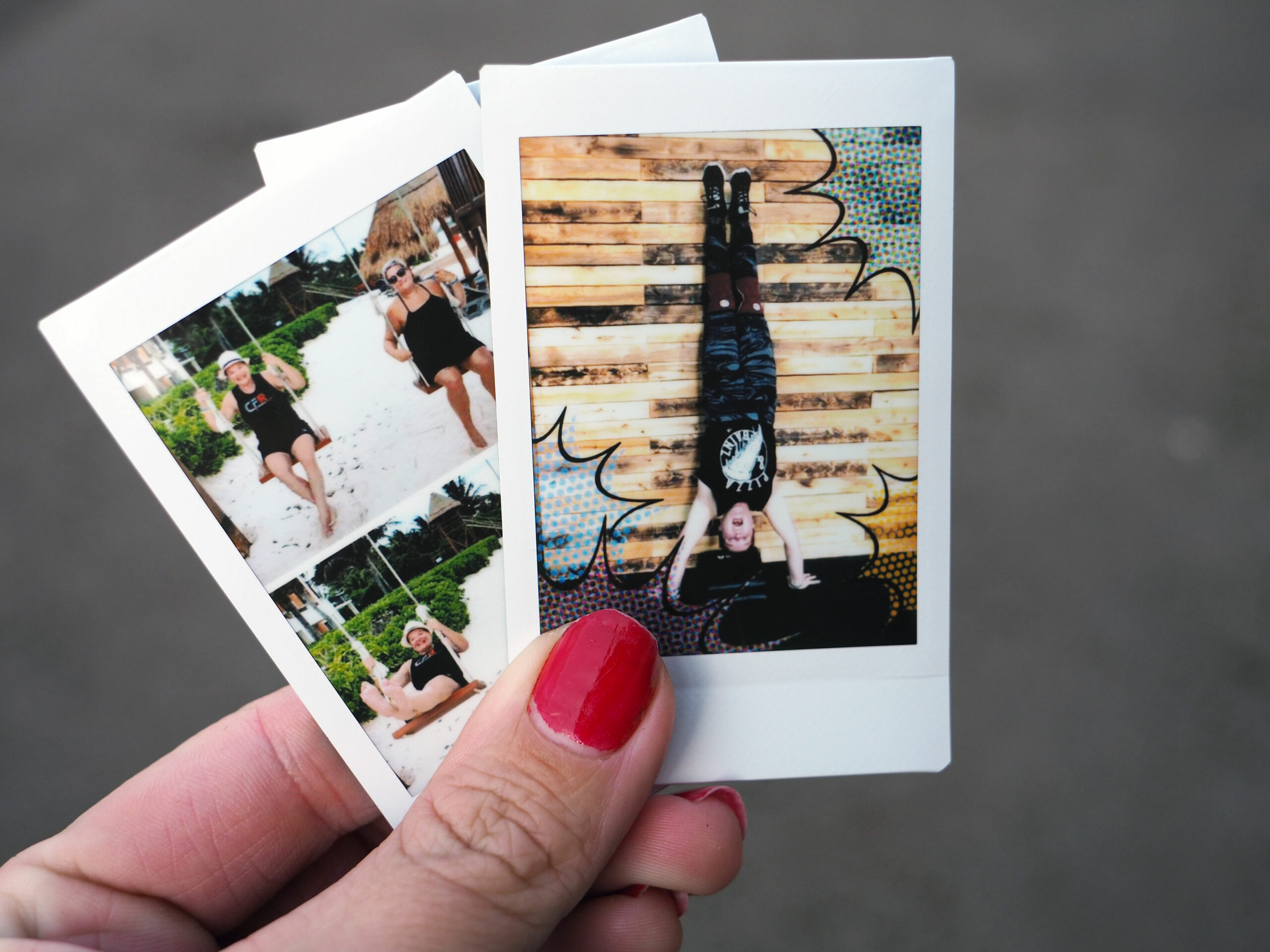
The Quiet Rise of Pocket Printers
Including printers in annual trend lists is becoming harder each year—but pocket printers deserve attention. Once limited to instant-print ecosystems like Instax, compact printers have now become more versatile and accessible.
Users are rediscovering the joy of physical prints, using pocket printers to bring digital images into the real world. As technology improves and consumable costs decrease, this segment is poised for further growth—quietly reinforcing the timeless appeal of printed photographs.
Scams like WedMeGood and more
While technology has streamlined wedding photography discovery, it has also opened doors to exploitation. The rise of aggregator platforms has unfortunately led to an increase in challenges/scams—going alone by what we have seen in the industry in 2025—this year more such stories will be unearthed.

In 2026, awareness around these practices will grow, forcing both photographers and clients to become more vigilant. Transparency, direct engagement and trust will become key differentiators in the wedding photography ecosystem.
Photography in 2026 stands at a fascinating crossroads—caught between unprecedented technological power and an equally strong yearning for authenticity. AI will undoubtedly continue to reshape how images are created, edited and consumed. But at the same time, the value of truth, intention and human perspective has never been higher.
Perhaps the real trend for 2026 isn’t a tool, a format, or a platform—but a recalibration. A reminder that while technology may change the way we create images, the reason we create them remains timeless: to document, to communicate and to connect.